Best practices
WCAG 3.0 introduces a new contrast method
WCAG 3.0 explores a more precise method for calculating contrast. Why isn't today's standard good enough?

To ensure good readability, all text should have sufficient contrast against the background. This is important for all users, especially under challenging lighting conditions. Those who need this most are the visually impaired, dyslexics, and the color blind (source: uutilsynet.no).
Need for stricter contrast requirements
All users, including those with impaired vision, should be able to perceive content in digital services. The Web Content Accessibility Guidelines (WCAG) provide success criteria and recommended solutions. However, current contrast rules do not fully align with the goal of making content visible to everyone.
Current regulations, WCAG 2.1
1.4.3 Contrast (minimum) (Level AA): The contrast ratio between text and background is at least 4.5:1. 1.4.3 Contrast (minimum), WCAG 2.1 (w3.org)
1.4.11 Non-text Contrast (Level AA): The visual presentation of the following has a contrast ratio of at least 3:1 against adjacent colors. 1.4.11 Non-text Contrast, WCAG 2.1 (w3.org)
Upcoming requirements:
1.4.6 Contrast (enhanced) (Level AAA): The visual presentation of text and images of text has a contrast ratio of at least 7:1, except for non-essential text and text sizes larger than 18px or 14px bold. 1.4.6 Contrast (enhanced), WCAG 2.1 (w3.org)
WCAG 2.2: 2.4.13 Focus Appearance (Level AAA), the appearance of the focus indicator requires that contrast ratio between the same pixels in the focused and unfocused states must be at least 3:1. Understanding Success Criterion 2.4.13: Focus Appearance (w3.org).
WCAG 3 discuss a requirement for color and contrast, visual contrast in text (silver): Ensure sufficient contrast between foreground text and the background of the text. A new method, called APCA, is suggested to calculate the contrast.
A new and more accurate method
In WCAG 3.0 there are discussions around a more accurate method than today's standard for calculating contrast and setting threshold values.
The method improves how the value between two colors is measured, and also differs based on whether the colors are in the foreground or background.
It also sets clear threshold values or target values for font selection, text size, and font weight. The method is called Advanced Perceptual Contrast Algorithm (APCA).
Our goal is to exceed AAA requirements in WCAG 2.1, witch means we will be closer to the threshold values in APCA. This increases the probability of meeting the requirement for everyone, including those with visual impairments, to be able to view the content on the website.
We follow a standard today that goes beyond the accessibility requirements
To ensure that the content in public digital services is accessible to all users, we aim to achieve compliance with WCAG 2.1 AAA.
To further enhance readability, we have ambitions to achieve contrast at level 4. This is the top level conformance, which is being discussed in an inactive proposal on contrast in WCAG 3.0 (w3.org)
Why isn't today's standard good enough?
We know that even if a solution meets the specific requirements from the universal design regulations, it is not necessarily universally designed and accessible. Since the eye's ability to perceive colors and light is not part of the method, it is unsuitable for calculating the difference in brightness in a combination of colors.
If we follow the method in WCAG 2, we technically meet the requirement for universal design, but this does not mean that the content is accessible or universally designed. Therefore, we will put in a lot of effort to also meet the future WCAG 3 requirements that use the APCA method.
Contrast in WCAG 2 "luminosity contrast algorithm"
"In WCAG 2, contrast is a measure of the difference in perceived luminance
between two colors. This difference is expressed as a ratio ranging from 1:1 (e.g.,
white on white) to 21:1 (e.g., black on white)." - WebAIM. The contrasts are calculated using the colors' RGB, HEX, or HSL
values in addition to transparency (alpha), whether the color is text, graphics, foreground
or background has no significance.
Contrast in WCAG 3 "visual contrast algorithm"
In WCAG 3 a
visual-contrast algorithm called APCA is suggested. It still uses the
color values to calculate the contrast, but also whether the color is
text, graphics, foreground or background. In addition, the choice of font,
font weight and size also have an impact on which contrast values are
approved. Different colors that in WCAG 2 would have achieved similar
contrast values could in APCA get different values. This is because it calculates to a greater extent
based on the eye's ability to perceive colors rather than just the technical
color value.
Tools for testing contrast values
The Brønnøysund Register Centre's color system can be found in the contrast tool (brreg.no). You can test how contrast values change depending on which text color, size, and weight you choose. And you can see which levels of requirements are met, whether they are WCAG AA or AAA levels, or APCA.
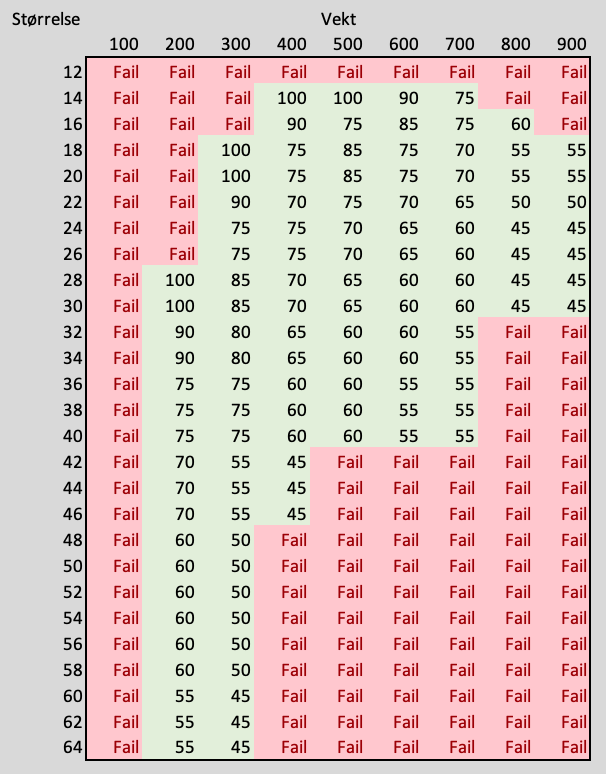
The threshold values above that indicate whether the contrast is approved or not are simplified from an early "silver" level table from the APCA work. When a finished model has been tested and recommended from WCAG 3, the threshold values will be adjusted.
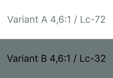
In the example above, we see that even though the contrast is calculated to be the same using the WCAG 2 method. The readability level differs for the texts in variant A and variant B. Both texts are 16px in normal weight, and both variants have a contrast of 4.6 to 1. In variant A, the text has the color #6D7879 with a white background. The text is somewhat readable. In variant B, the text is black, and the background has the color #6D7879. The text is slightly less readable than variant A.
References and further discussions
Several discussions in the ongoing work on WCAG 3 is on the topic of contrast. There is also wikis from both active and inactive working subgroups that can shed light on the situation.
- Visual Contrast of Text Subgroup, an inactive group working on contrast, suggested that conformance for AAA-level in WCAG 2 would be equal to Score 3 in what was then the discussed conformance-levels of WCAG 3 (w3.org)
- The published draft as of August 2025, for WCAG 3 does not include the contrast requirements or the method for APCA method. (w3.org)
- Multiple reference tables have been suggested for various conformance levels (w3.org), some of them suggested by the author of APCA can provide an understanding of the complexity.
- Myndex Github repo for w3c WCAG 3 (github.com)
- Find multiple discussions in the WCAG 3 Github repo on the subject of contrast (github.com), i.e. there is a list of independent sources that has made their own investigations on APCA. (github.com)
- Interview with the creator of APCA, where he talks about subjects like "why the WCAG 2 contrast method is problematic" and also about the science behind APCA, all with examples. Video: How APCA Changes Accessible Contrast with Andrew Somers (youtube.com).
Contribute to the article?
We would like your input and feedback on the article. Send us an
email at: designsystem@digdir.no or contact us on Github.
Contributors
Edit this page on github.com (opens in a new tab)