Get started
Learn how to get started with Designsystemet


Learn how to get started with Designsystemet
See the overview of UI components created in React, CSS and Figma.
Understand how shared patterns contribute to consistent user experiences

Designsystemet is a shared toolkit of UI components and guidelines for developing digital services. It is free to use, designed to be used with an organisation’s own visual identity, and supports efficient product development and coherent user experiences.
Read more about Designsystemet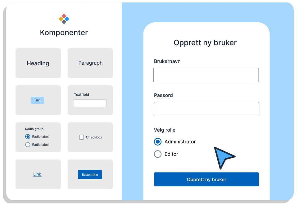
By creating the most basic components once in a common design system, we ensure high quality. Each component is thoroughly tested and meets accessibility requirements. Components are built in both Figma and React, and can be combined in various ways to support different patterns.
Read more about accessibility
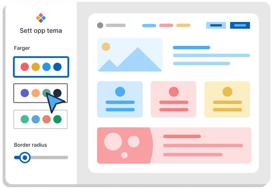
With theming, Designsystemet makes it possible to support different visual identities. This means everyone can build on the same foundation while tailoring the design to their own brand.
Build your theme

@digdir/designsystemet-web package is now released
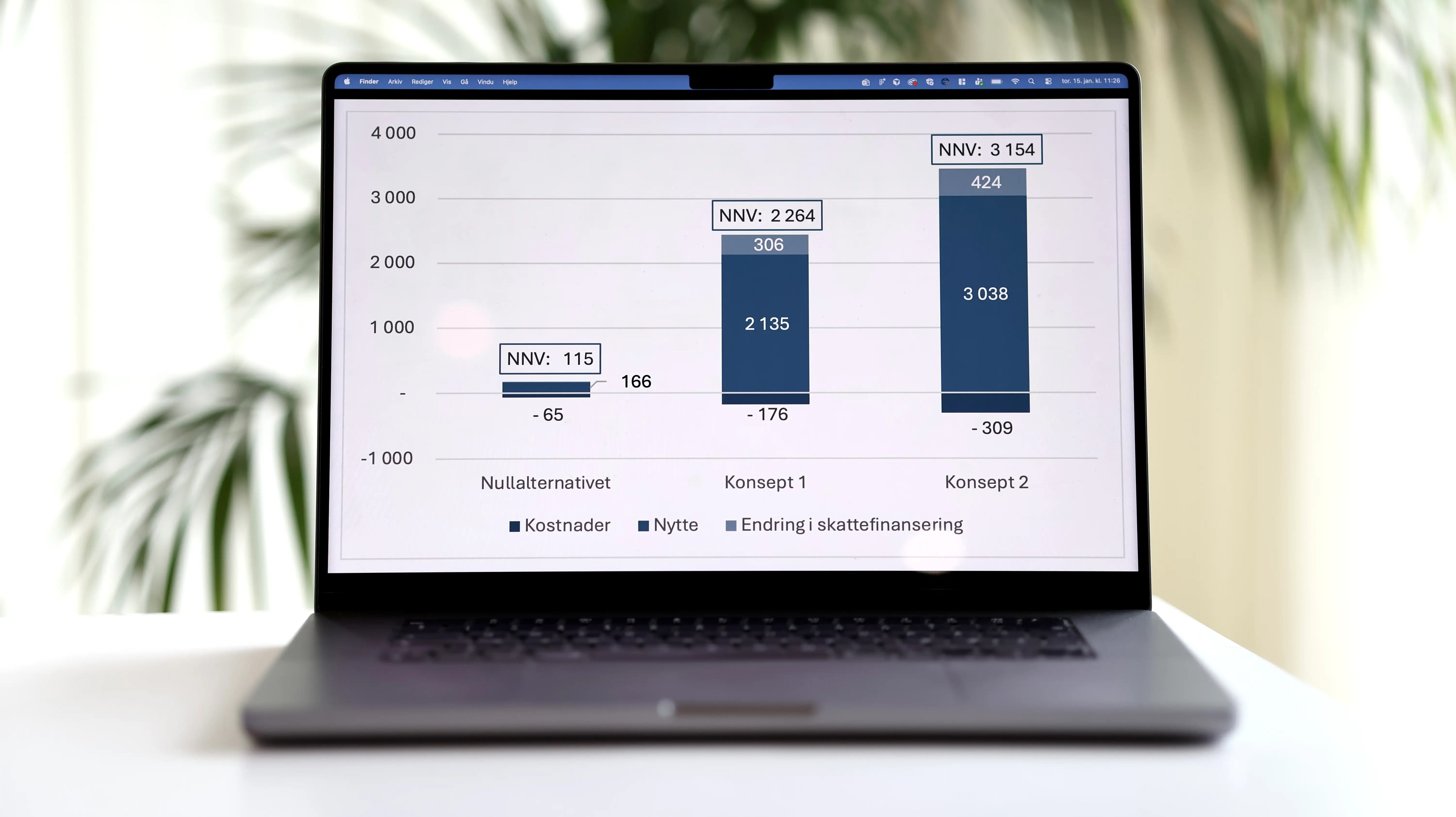
A new Cost–Benefit Analysis shows that Designsystemet delivers clear societal value, both through time saved within organisations and through important, long-term quality benefits for society.
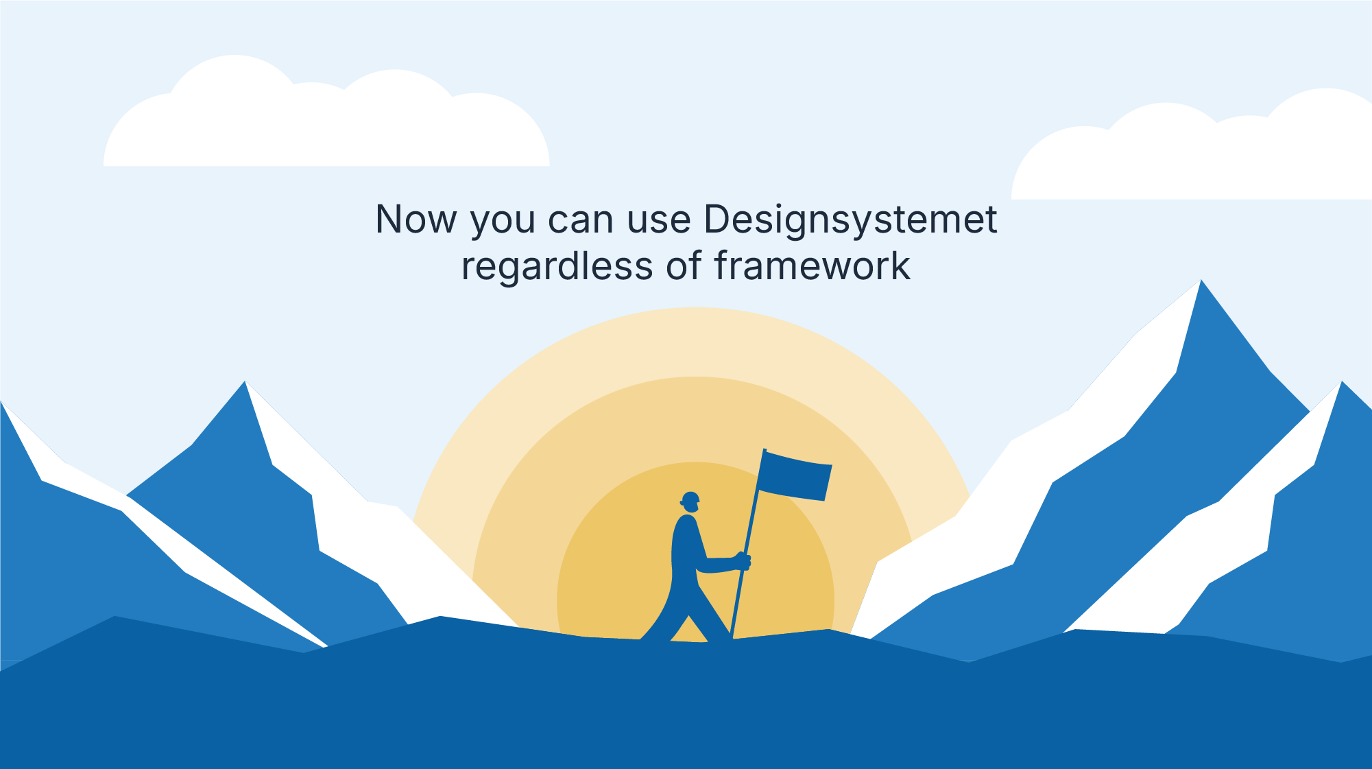
Second prerelease of the @digdir/designsystemet-web package, which provides the ability to use the Designsystemet without React.
A joint effort to improve user experiences across public services. Together we develop a common foundation for good, accessible and holistic digital solutions.

By collaborating on Designsystemet, we can create more recognizable behavior in components and interaction patterns across the public sector. Designsystemet is meant to be a shared home for reusable components, best practices, user dialogue, insights, and more. Want to learn more or get involved? Get in touch!
