Theme Builder as a bachelor project
How can we make it easier to adopt Designsystemet? This has been explored in a bachelor thesis!
Kristian Birkeli, a bachelor student in Computer Science at UiS, has during the spring semester of 2024 completed a bachelor thesis in collaboration with Digdir and Designsystemet.
In his thesis, Birkeli has explored how it can become easier to adopt and use Designsystemet. He has conducted a series of interviews with users and potential users of Designsystemet. Through these interviews, we have gained insight into what is currently challenging about adopting Designsystemet, as well as the expectations of potential users.
Theme Builder
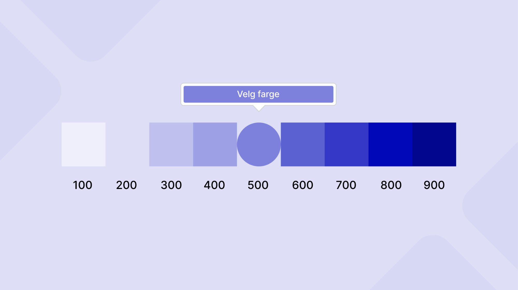
Part of the project has been to explore and prototype a "Theme Builder" with a graphical user interface that makes it easier to see how components from Designsystemet can be adapted to individual sender identities. The Theme Builder also had the ability to export selected values to CSS to make it easier to get started with using Designsystemet.
By using the tool, users can see the components from Designsystemet with their own colors with just a few clicks.
User Tests and Further Work
User testing of the prototype has also been an important part of the bachelor project. The user tests, which have been conducted with six designers and developers, have given us valuable insights into what it takes to make Designsystemet easier to adopt.
Digdir has already taken the insights further in their work to improve the token structure and color system. Through the user tests, it emerged that the existing color system was difficult to understand. The Action color only affected the Button component, but it was expected to function as an accent color that affected multiple form elements. Based on these insights, Digdir has further explored a completely new color system and token structure that will support theming further.
The insights also showed that users expected the tool to automatically maintain contrast requirements. We therefore worked further on a color system that is based on the organization's brand color, while ensuring that colors intended for text always have sufficient contrast against colors intended for backgrounds, both for light and dark mode.
We thank you for the collaboration
We thank Birkeli for a very good collaboration through weekly meetings. The prototype Birkeli has developed, and the insights gathered, are extremely important contributions that make us better equipped to establish a color system and token structure that is more flexible, easier to understand, and still maintains contrast requirements. The team behind Designsystemet will continue to create a theme builder for Designsystemet based on the work Birkeli has started.