Dynamic text sizes and why we moved away from it
It's possible to use dynamic text sizes without breakpoints
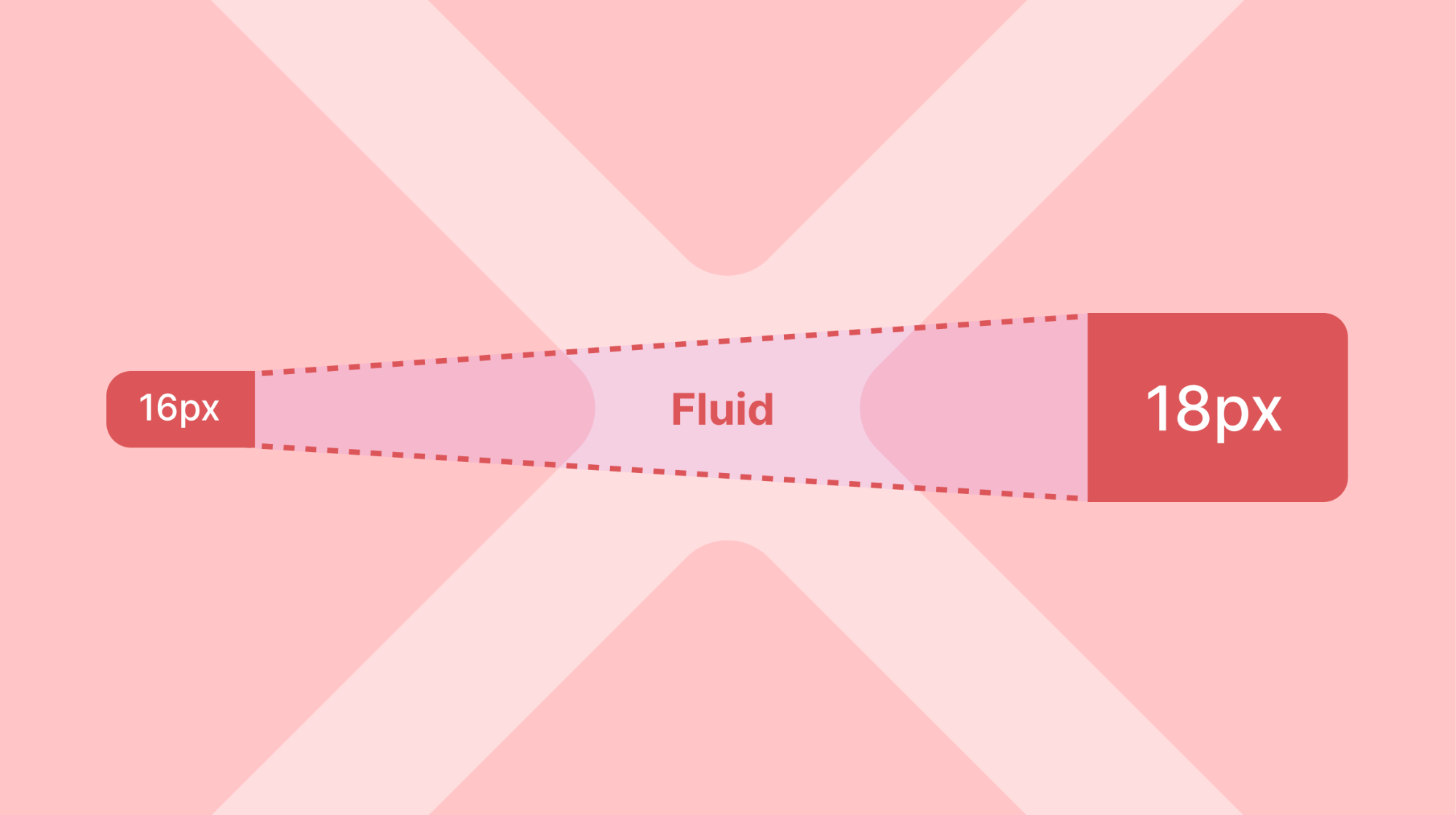
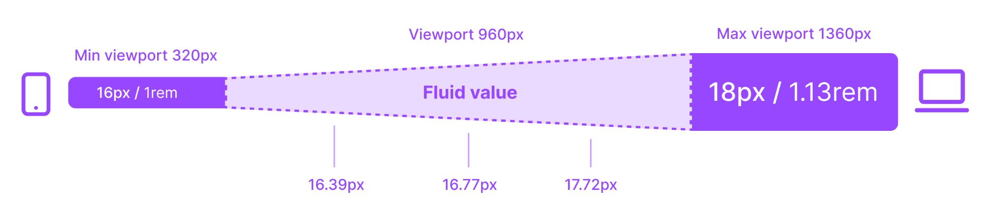
With "Fluid typography," we can scale the text size gradually between a minimum and maximum width, instead of having an abrupt scaling at a specific breakpoint. The linear function approaches the desired size evenly across the screen width.
The text sizes increase gradually from a viewport width of 320px until it reaches the maximum width of the viewport, which is set to 1360px. A text of 16px will, for example, increase to 18px on the largest viewport.
Advantages
- You don't have to think about breakpoints; the size of the font is automatically adjusted to the screen.
- When sizes aren't adjusted at specific breakpoints, we avoid piecemeal and sudden upscaling.
Disadvantages
- Half pixels. Figma rounds down. Some browsers round up, others down. This means things don't look the same in Figma and in the browser.
- You may feel you have less control.
- In Figma, this size change can only happen using the "Token Studio" plugin when you have activated the desired viewport for your frame.
- It's not a given that a product will build its product using dynamic typography. If someone adds modules from Designsystemet to their own interface, it won't match their scaling.
Based on the disadvantages this caused, we chose to go with a static typography scale as the standard for Designsystemet.
Do you need dynamic typography?
If you need to use dynamic typography, please create a feature request, and we can consider the possibility of activating "Fluid" as a separate set.
The sizes used in the dynamic scale were generated using the Fluid Typescale Generator
| Step | viewport 320px | viewport 1360px |
|---|---|---|
| f-3 | 12.00px / 0.75rem | 12.00px / 0.75rem |
| f-2 | 13.00px / 0.81rem | 13.00px / 0.81rem |
| f-1 | 15.00px / 0.94rem | 16.00px / 1.00rem |
| f0 | 16.00px / 1.00rem | 18.00px / 1.13rem |
| f1 | 18.00px / 1.13rem | 21.00px / 1.31rem |
| f2 | 19.00px / 1.19rem | 24.00px / 1.50rem |
| f3 | 21.00px / 1.31rem | 28.00px / 1.75rem |
| f4 | 23.00px / 1.44rem | 32.00px / 2.00rem |
| f5 | 26.00px / 1.63rem | 38.00px / 2.38rem |
| f6 | 29.00px / 1.81rem | 44.00px / 2.75rem |
To see the correct text sizes in Figma, we were dependent on having the Tokens Studio for Figma plugin installed and using it to activate the correct viewport. The video below shows how the plugin was used to get the correct text sizes for different viewports.