HelpText is being removed, what should you do?
We are removing HelpText from Designsystemet. Why, and what can you do if you still want to use it?
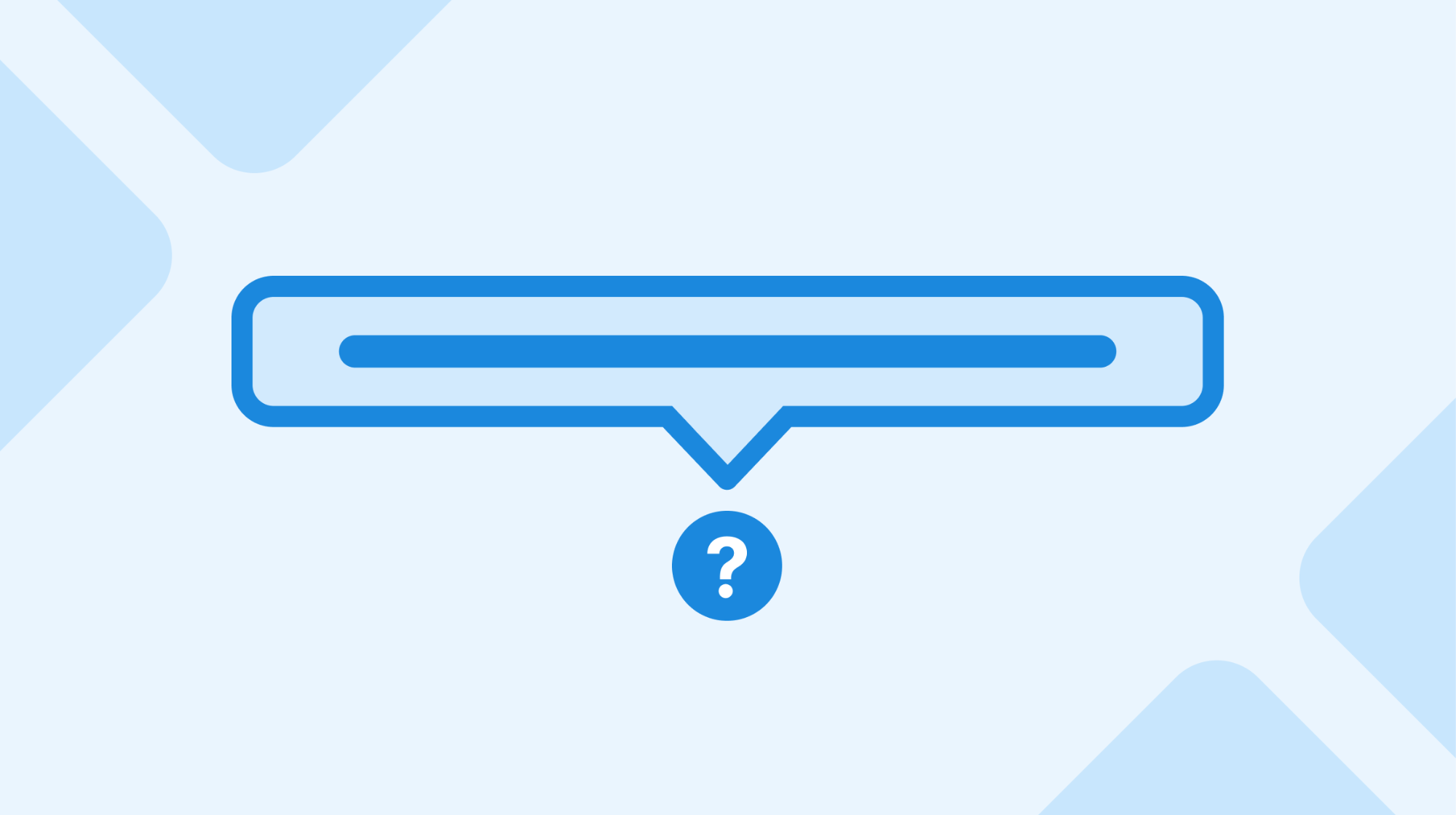
Designsystemet is removing HelpText
, which means it won't be included in version 1. Why are we doing this? And what should you do if you're still using it?
At the bottom of this article, you'll find code to implement this component yourself.
HelpText
?
Why are we removing It has been a challenging component to recommend consistently, and several factors indicate that it doesn't fit in Designsystemet:
- Easy to implement yourself:
HelpText
is essentially a popover attached to a button, which can easily be created with a short CSS snippet and existing components. - Unclear use case: We don't have clear recommendations for when and how help text should be displayed, so the component can easily be misused.
- Uncommon in design systems: Few design systems include a dedicated
HelpText
component, precisely because help text varies greatly in form and context. - Limits flexibility: Offering
HelpText
as a standard popover creates expectations that help text should always be displayed this way. There are several solutions better suited for different situations.
What should you do if you're still using it?
If you've been using HelpText
, you'll find a code snippet at the bottom of this article showing how you can implement the functionality yourself. This solution gives you the freedom to customize help text according to your needs.
Further work
We're working on clarifying when and how help text should be integrated into interfaces, and look forward to offering more precise recommendations in the future. A pattern for different types of help text will eventually be developed.
Code
You can use the code below to compose your own HelpText
component. The CSS snippet includes an icon; the class should be added to Popover.Trigger
.
CSS
.ds-helptext {--dsc-helptext-icon-size: 65%;--dsc-helptext-icon-url: url("data:image/svg+xml,%3Csvg xmlns='http://www.w3.org/2000/svg' fill='none' viewBox='0 0 8 14'%3E%3Cpath fill='%23000' fill-rule='evenodd' d='M4 11a1.5 1.5 0 1 1 0 3 1.5 1.5 0 0 1 0-3ZM4 0c2.2 0 4 1.66 4 3.7 0 .98-.42 1.9-1.17 2.6l-.6.54-.29.29c-.48.46-.87.93-.94 1.41V9.5H3v-.81c0-1.26.84-2.22 1.68-3L5.42 5C5.8 4.65 6 4.2 6 3.7 6 2.66 5.1 1.83 4 1.83c-1.06 0-1.92.75-2 1.7v.15H0C0 1.66 1.8 0 4 0Z' clip-rule='evenodd'/%3E%3C/svg%3E");--dsc-helptext-size: var(--ds-size-7);border-radius: var(--ds-border-radius-full);border: max(1px, calc(var(--ds-size-1) / 2)) solid; /* Allow border-width to grow with font-size */box-sizing: border-box;height: var(--dsc-helptext-size);min-height: 0;min-width: 0;padding: 0;position: relative;width: var(--dsc-helptext-size);@media (forced-colors: active) {color: ButtonText;}&::before {content: '';border-radius: inherit;background: currentcolor;mask-composite: exclude;mask-image: var(--dsc-helptext-icon-url);mask-position: center;mask-repeat: no-repeat;mask-size: var(--dsc-helptext-icon-size) var(--dsc-helptext-icon-size), cover;scale: 1.1; /* Hide tiny half pixel rendeing bug */width: 100%;height: 100%;@media (forced-colors: active) {background: ButtonText;}}&:has(+ :popover-open)::before {mask-image: var(--dsc-helptext-icon-url), linear-gradient(currentcolor, currentcolor); /* Cut icon out of currentcolor surface */}@media print {display: none;}}
Markup
export type HelpTextProps = {/*** Required descriptive label for screen readers.**/"aria-label": string;/*** Placement of the Popover.* @default 'right'*/placement?: "right" | "bottom" | "left" | "top";} & Omit<ButtonHTMLAttributes<HTMLButtonElement>, "color">;export const HelpText = forwardRef<HTMLButtonElement, HelpTextProps>(function HelpText({ placement = "right", children, ...rest },ref) {return (<Popover.TriggerContext><Popover.TriggerclassName="ds-helptext"ref={ref}variant="tertiary"data-color="info"{...rest}/><Popover placement={placement} data-color="info">{children}</Popover></Popover.TriggerContext>);});
Putting it together
In this CodeSandbox, you can see how to put the code snippets above together.