First version of Designsystemet is ready!
Finally, V1 is here! After an extensive development process and close collaboration with several public entities, we are now launching the first stable version of Designsystemet!
V1 is the result of a long and educational journey spanning two years. Along the way, we've made major changes, and in the middle of the process, we've become a more cross-agency team, where Digdir, the Norwegian Food Safety Authority, the Norwegian Directorate for Education and Training, and the Brønnøysund Register Centre have worked closely together on the development. Together, we've changed direction, adapted to new insights, and worked our way towards what is now becoming the first version of Designsystemet.
Recording from the launch on March 20
900 participants from 270 different organizations signed up for the launch to learn how Designsystemet can be used, both directly in solutions and as a foundation for other design systems.
Watch video on vimeo.comWhat does V1 entail?
At one point, we locked version 0.63, in connection with major changes that were to be made to the underlying token structure. After this, we've rolled out several "Release Candidates" for V1, and have now ended up with what becomes the first version of Designsystemet.
Version 1.0.0 contains several improvements and new features:
- Improved accessibility: All components are developed with a focus on universal design, and we have made thorough assessments to ensure they are accessible. We stay close to native HTML where possible, so that the components work intuitively with screen readers, keyboard navigation, and other assistive technologies without extra adjustments.
- More flexible design tokens: We have introduced a more robust token structure that makes it easier to adapt colors, typography, and dimensions to different needs.
- Better integration without React: To ensure broader application, we have made the components easier to use in different technological frameworks.
- New and improved components: Based on user feedback, we have improved several components to increase usability and ensure a cohesive component API.
- Better documentation: We have updated the documentation to make it easier for developers and designers to get started and understand how they can best utilize the system.
What does this mean for you as a user?
The launch of V1 means that you now have access to a more mature and stable design system that gives you:
- Easier implementation in your solutions.
- A stable version with fewer major changes, which provides increased predictability.
- A well-developed token structure that provides greater flexibility and control. And which ensures that we work with the same values in design and code. Many don't have this connection between design and code today, but now they can!
- Easier customization of Designsystemet's components to your own profile and preferences. --> Set up your own theme.
- Increased accessibility across digital services.
- Opportunity to contribute and collaborate with a growing community of designers and developers.
The transition from beta to V1
For those who have already started using the beta version of the Design System in React, we have developed a guide to help you update from v0.63 to v1.0.0 in a smooth way.
--> Migration guide
Please note that if you have made manual overrides in your solutions, you must ensure that these are translated to the new version of design tokens yourself.
The way forward
Even though we are now launching V1, there are still areas we are exploring further. For example, updates will come in the future that fine-tune the color balance and user experience in dark mode. We will continue to collect feedback, improve documentation, enhance functionality, and add new components based on the fundamental needs that recur across the board. We will also offer Web Components for some of the components eventually so that they can be used with Svelte, Vue, Angular, and other technologies.
We will continue with the open monthly demos that we have had for the last two years. We've found it very valuable to work openly from the start. It has allowed us to get feedback early and adapt to real needs. The open approach has given us valuable insight from a wide range of testers and users, and we find that the more people contribute, the stronger the foundation and quality becomes. Even though V1 is being launched, we continue to learn continuously and will manage the system based on insight and data, so that it is always developing and adapted to the actual needs.
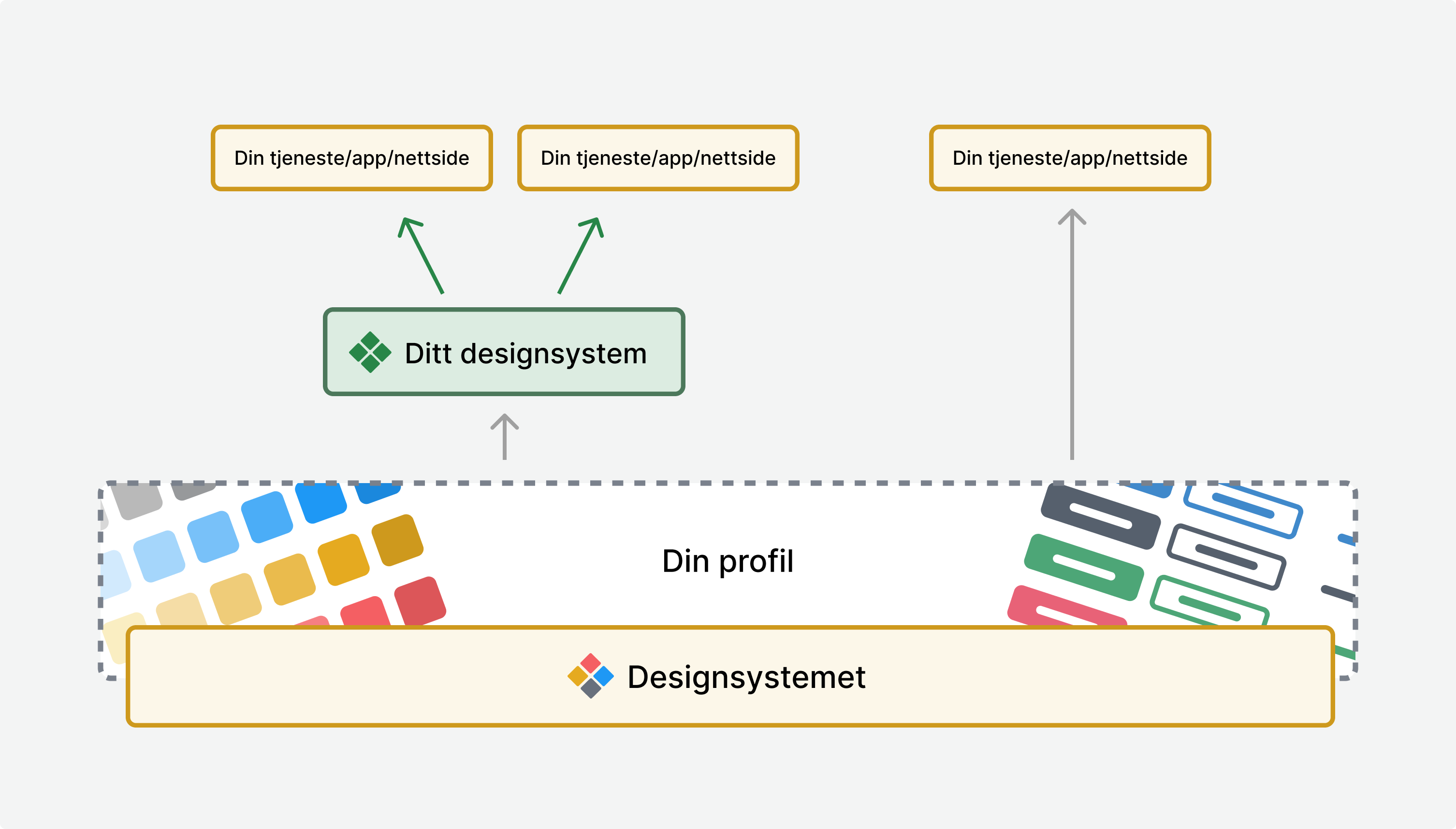
The goal is for Designsystemet to be a good foundation that you can build upon, with your own profile, own preferences, and extended functionality as a layer on top.
Designsystemet is already in use by many, including Altinn Studio, where 70 different agencies develop their services. If you use Altinn studio to develop services, you automatically use components from Designsystemet.
Several public organizations have also adopted Designsystemet in their own services.
- The Norwegian Food Safety Authority builds its design system on top of Designsystemet.
- The Norwegian Directorate for Education and Training builds its design system on top of Designsystemet.
- The Brønnøysund Register Centre has adopted Designsystemet on Business Information and Support Register, among others.
- Data.norge.no uses tokens, components, and patterns from Designsystemet.
- The Norwegian Customs has adopted Designsystemet on their websites.
- KS Digital has adopted Designsystemet on ledsagerbevis.no, among others.
- The Norwegian Labour Inspection Authority has adopted Designsystemet on their websites.
- Help page for shared solutions uses tokens and components from Designsystemet.
- Digdir.no, UU-tilsynet, UU-status, the collaboration portal use tokens from Designsystemet.
Do you have input or would you like to contribute? Send us an email or join the community on Slack. Please let us know if you have used or are considering using Designsystemet.
We look forward to seeing how Designsystemet can further streamline product development and help create more user-friendly digital solutions for everyone!