Patterns
User-triggered error messages
How to tell users that something has been filled in incorrectly or is missing in a form.


Introduction
Error messages can come from the system or be triggered by something users have done. This article focuses on user-triggered error messages in self-service solutions and forms. You can find information about system alerts in the article on system notifications.
When users have made an error that prevents them from proceeding, we should notify them about the error so they can correct it:
- Describe the problem in an easy-to-understand way.
- Explain what users need to do to proceed.
- Make sure the error message is clearly visible.
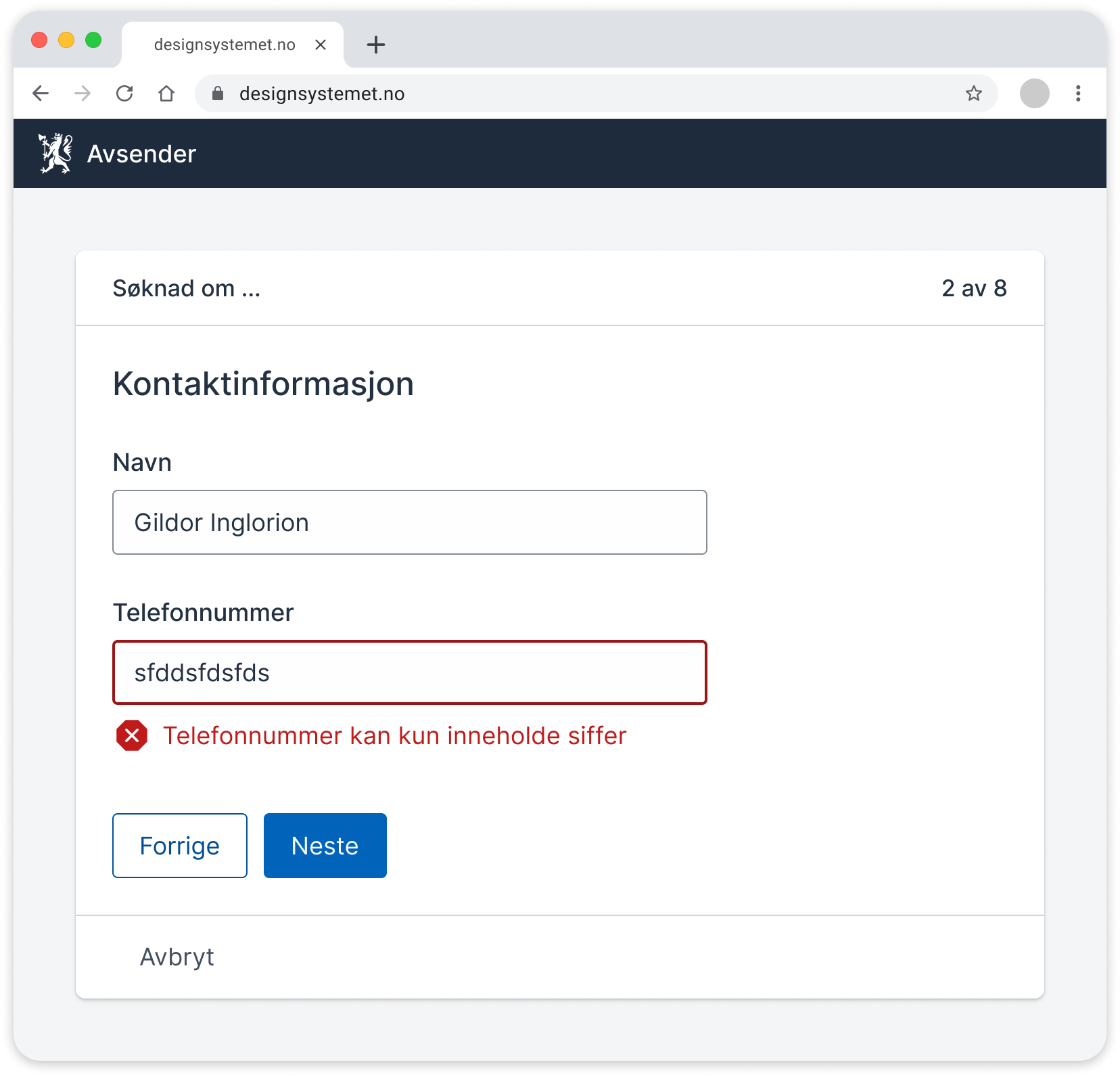
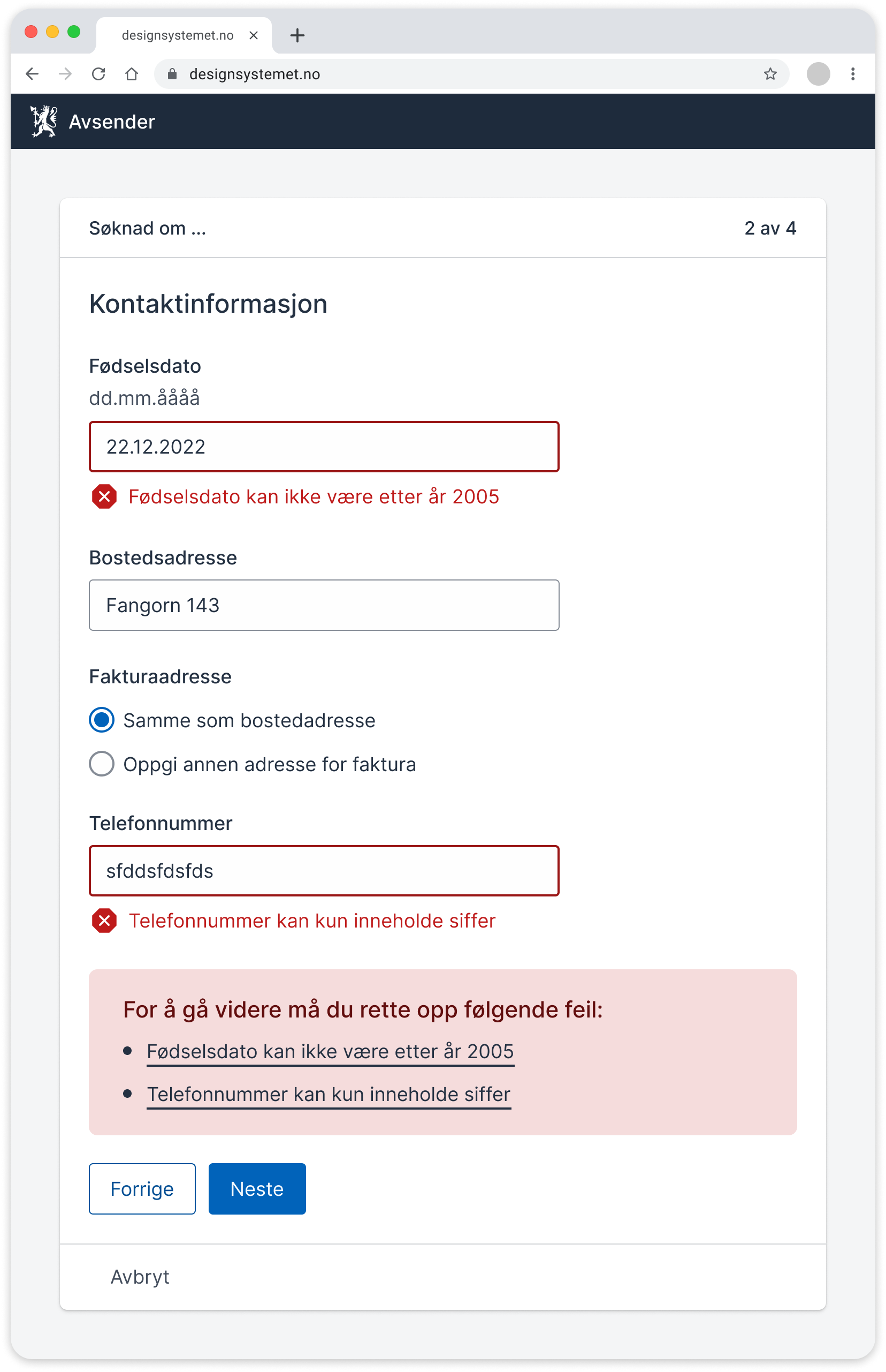
Error messages can be related to a single field or to multiple fields. We show a summary of multiple errors if the user tries to proceed without filling in everything.
Error messages for individual fields
We should be able to show error messages with all types of fields in a form. The message should be close to the field that's failing.
See ValidationMessage for an example of implementation.
Summary of multiple error messages
A summary can apply to one or more errors. If users try to proceed without filling in everything, or they have made mistakes, we summarize these just above the Next/Submit button.
We recommend showing the summary near the Next button so that users understand the connection between the error and why they are prevented from proceeding. In some cases, however, it may be better to show the summary at the top, for example if:
- the technical solution reloads the page when users select Next
- users have been away from a form and are returning to it
- the solution doesn't stop users from going to the next page even if there are errors on a page
Make sure that:
- the summary shows all error messages that apply to the page or step
- users can go directly to the errors they need to fix, and the focus is moved there
- the links in the summary match the error messages they link to
- the errors disappear from the summary as users fix them
- the error message in the summary includes keywords from the label text
See ErrorSummary for an example of implementation.
It's best to avoid giving error messages
When planning a solution, the goal should be to prevent errors from occurring. These points can help in the planning:
- Provide all relevant information before users start, in clear and simple language.
- Use labels and descriptions to assist users along the way.
- Avoid help texts behind question marks if possible, but use them if necessary.
- Allow users to change answers in fields or go back.
- Let users take a break from filling out or cancel the process.
- Ensure that fields accept different formats, for example for dates and phone numbers.
- Arrange answer options in a specific order to prevent users from making choices that lead to errors.
- Display information about the maximum number of characters under the label if the field has a character limit.
Different types of error messages
System-generated messages
We use system messages, or system alerts, to notify users about system errors or provide them with important information they should be aware of. We have a separate article on system alerts.
Informational messages for users
Informational messages triggered by user actions do not prevent users from submitting or proceeding to the next step.
We display informational messages when we need to inform users about the consequences of a choice. Such messages can, for example, be presented in an alert of type "info" or "success." These messages appear after the user has provided information in a form field and behave in the same way as error messages.
Examples:
- You start a business and register the name. You are informed that the business name is already in use by someone else. You can use the name you have chosen, but you may encounter issues with domain names or your business being confused with another.
- You make a choice in an application form that leads to longer processing time. You receive an informational message about the extended waiting time.
Language
Write good error messages
The most important job of an error message is to help users move forward:
- Write in a friendly, clear, and concise manner.
- Keep the error message as short as possible.
- Be specific. If we write “The field is not filled out correctly,” the user gets no explanation of what is wrong.
- Repeat keywords from the label/field name as early as possible in the error message.
Some technical solutions allow us to include the field name as a variable in error messages, in which case the field name is in indefinite form, as in these examples:
- “Postal code must have 4 digits”
- "National ID number must have 11 digits"
- “Select at least one delivery option”
If the solution does not include the field name as a variable in error messages, we recommend writing the noun in the definite form: The postal code must have four digits.
Design and experience
Appearance of error messages
When an error occurs in a field, it is important that the field is clearly visible, making it easy for users to see where they need to fill in or correct something.
When the technical solution checks for errors, known as validation, we want to show which fields have errors. To do this, we can use several methods.
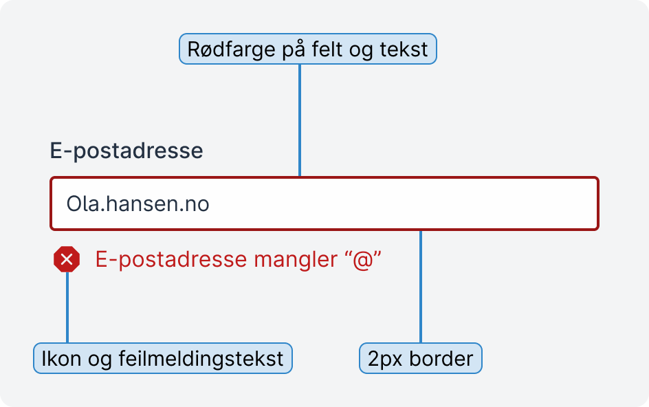
Visual changes
Display the error message text close to the field it pertains to. We recommend including an icon as a visual indicator in addition to the text. For form components that allow it, we can also change the thickness of the border, as shown in the example above.
Color choices
We use red as the warning color for errors, meaning the field and the error message itself become red. This is a well-established pattern that helps distinguish the field from other fields.
The field must have a 3:1 contrast to the background color. If we also use red text for the error message, it must have a minimum contrast of 4.5:1. Read more about contrasts at the Norwegian Authority for Universal Design of ICT.
How to position an error message
We display the error message below the field with the error. This is the most common pattern, although there is also discussion about whether it should be placed between the label and the field.
Note: We aim to stay updated on other recommendations regarding placement and have ongoing discussions about this on Git.
When should we display an error message?
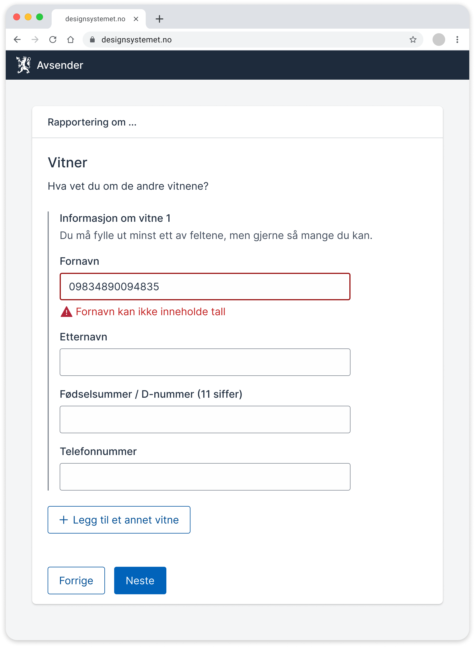
We can display error messages when users leave a field, when they choose to proceed, or when they submit. We avoid displaying error messages while the user is filling out a field.
When users make an error while filling out a field and proceed, we display error messages when we can see that the user has not filled out what we expect. An example could be entering letters in a national ID number field or an email address missing the @ symbol.
Users should not receive an error message for an empty mandatory field until they go to the next page or submit the form. We do not always know when the user has finished filling out the fields, so we wait until the user is ready to proceed. This is especially important when users navigate the solution using the keyboard.
Cross-validation
Sometimes, what the user selects in one or more fields affects fields that come later in the form. For example, a choice users make in a radio group may make a voluntary field later in the form mandatory. A choice in one place can also mean that a choice in another place must be within a certain value. In such cases, we talk about cross-validation.
Here, we must make it as clear as possible to the user that multiple fields affect each other:
- Mark all fields visually and with an error message.
- Explain what triggered the error. Be clear that the error is due to cross-validation.
- Tell users what they can do to correct the error.
Error messages that apply to multiple fields
In this example, we have a group of fields where the user may not have all the information but must fill in at least one field.
Example of an error message that applies to multiple fields
The video below shows the user attempting to proceed without filling in at least one required field. All fields in the group then turn red, and an error message appears at the bottom.
If there had been only one error in the group, the error message would have appeared in the usual way under just one of the fields, without the entire group turning red.
Code
Error messages and accessibility
There are several WCAG criteria that apply to error messages. We have taken these into account in the work on this article. If you want to know more about this, you can read the interpretations of the WCAG requirements at the Norwegian Authority for Universal Design of ICT.
Relevant WCAG requirements:
- 3.3.1 Error Identification
- 3.3.3 Suggestions for Error Correction
- 1.4.3 Contrast (Minimum)
- 1.4.11 Non-text Contrast
Do not disable the submit button
We do not use a disabled "Proceed/Submit" button to validate the form. Some users do not understand why the button is disabled and become confused. Users with visual impairments may struggle to find the button and think the form has technical issues. If users try to proceed while there are still errors in the form, we can instead display a summary error message above the "Proceed/Submit" button.
HTML and Aria
To ensure all users perceive error messages, it is important to establish a clear relationship between the error messages and the fields they belong to, even for those viewing the content with various assistive technologies.
We can use these aria attributes and roles:
- Set
aria-invalid="true"on fields with errors to indicate that there is an error. - Use
aria-describedbyto link the error message to the field.
We avoid using aria-errormessage for now as it does not have full support from assistive technologies at this time. However, we will update the guidelines if support improves in the future. See discussion on GitHub
Provide automatic notifications
We can also provide automatic notifications when we want the user to have important information read aloud as soon as possible. This can be, for example, when there is a significant visual change or new content.
For error messages that appear dynamically, we must use aria-live so that the message is read aloud by screen readers. Be careful when setting aria-live to assertive or polite. In most cases, it is best to use polite, as this makes the screen reader wait to read the error message until it has finished reading the current content.
Sources
- Help users to Recover from validation errors, GovUK
- Designing Better Error Messages UX, Smashing Magazine/Vitaly Friedman
- Formidle feil i skjema, UU-tilsynet
- Use forgiving formatting, NN Group
- Error Messages Guidelines, NN Group
- How to Report Errors in Forms, NN Group
- Suksesskriterium 3.3.1 Identifikasjon av feil
- Suksesskriterium 3.3.3 Forslag ved feil
- Skjemavalidering, Aksel
- Fejlmeddelelser, Fælles designsystem
The guidelines have been developed in a cross-agency working group with participants from Digdir, Nav, Skatt, Brreg, Politiet, KS DIF, and Oslo kommune. You can influence the work in the discussion thread on system alerts on GitHub or in #Pattern-channel on Slack.