Patterns
System notifications
How to help users understand situations in the service that are not caused by their own actions.


Introduction
We use system notifications to inform users about errors in the system or important events they should be aware of. System notifications are not related to user actions, as validations are. You can find information about validation errors in the article about user-triggered errors.
System notifications can come in various forms, for example as an alert or a modal. How we communicate system notifications depends on the answers to these questions:
- What type of information is it?
- How serious is the information in the notification?
- What is the context of the notification? Does it belong to a specific part of the service or does it cover the entire system?
- Do users need to do something or not?
- Should the notification be shown for a planned event, or is it for a sudden event?
We will now take a closer look at the language we use in notifications, and how we should design different types of notifications. Finally, we will address implementation in code, focusing on accessibility.
Language
A good system notification should be informative, clear, and user-friendly.
Write in a welcoming and helpful way
- Briefly explain what is wrong and how users can move forward. You can use subheadings and bullet points to make it easier to scan the information.
- Be clear that it's not the user's fault. Tell them that the error is on our side.
- We can apologize by writing "sorry," "unfortunately," or "thank you for your patience."
- Be careful with humor - it's rarely funny when something goes wrong.
Help the user move forward
- Tell users what they can try themselves.
- Make sure users have information to describe the error to support, for example where the error occurred. Provide the error code if it's important for support to be able to solve the error.
- Provide contact information for support if it's a system error. Avoid the word "please" ("Please contact support"), as it's a transfer from English and can be perceived as impolite. Instead, write "You can contact support."
Test the notifications
Test the notifications on real users to ensure they are easy to understand.
Different levels of severity
It's important to use appropriate means to communicate severity. Misuse of notifications can weaken trust and cause important messages to be ignored. By clearly distinguishing between critical errors, important messages, and information, we ensure that users receive the right information at the right time and understand what requires immediate action.
Another important thing to remember is that system notifications must never overshadow notifications concerning people's lives and health. For example, if you need to notify that the water is not safe to drink. Such notifications should always take priority over technical system notifications, no matter how serious we think the system notification is. This way, we ensure that vital information always reaches the citizens. If you need to notify about serious incidents not related to the system, you should therefore not use the components intended for system notifications.
A) Critical system errors
When we have errors that affect all or large parts of the system, users should be notified early. If the system is down, the notification should be clear about it. We can communicate this in several ways, for example by changing the home page to have a different text poster than usual, or we can display a modal telling users about the critical errors.
B) Important system message
Not all errors are critical, but sometimes temporary errors affect how users experience the service. Let's say we need to notify about longer processing times for applications. Then we can place a global alert at the top of the page. If the message only applies to parts of the service, we should give the notification where the error applies. If the user must make an active choice, it may be better to use a modal. For example, to notify that you'll soon be logged out if you don't make an active choice to remain logged in.
C) System information
Users may also need to receive less important system notifications. This could be information about scheduled maintenance or notification that a new version is available. Such messages can be displayed with an alert.
Design and experience
There are several different ways to present system notifications to users. We should choose the presentation method that makes users perceive the notification as useful. The notification must not create confusion or frustration.
Let's take a closer look at error pages and the components modal and alert. When and how should we use them?
When do we use error pages?
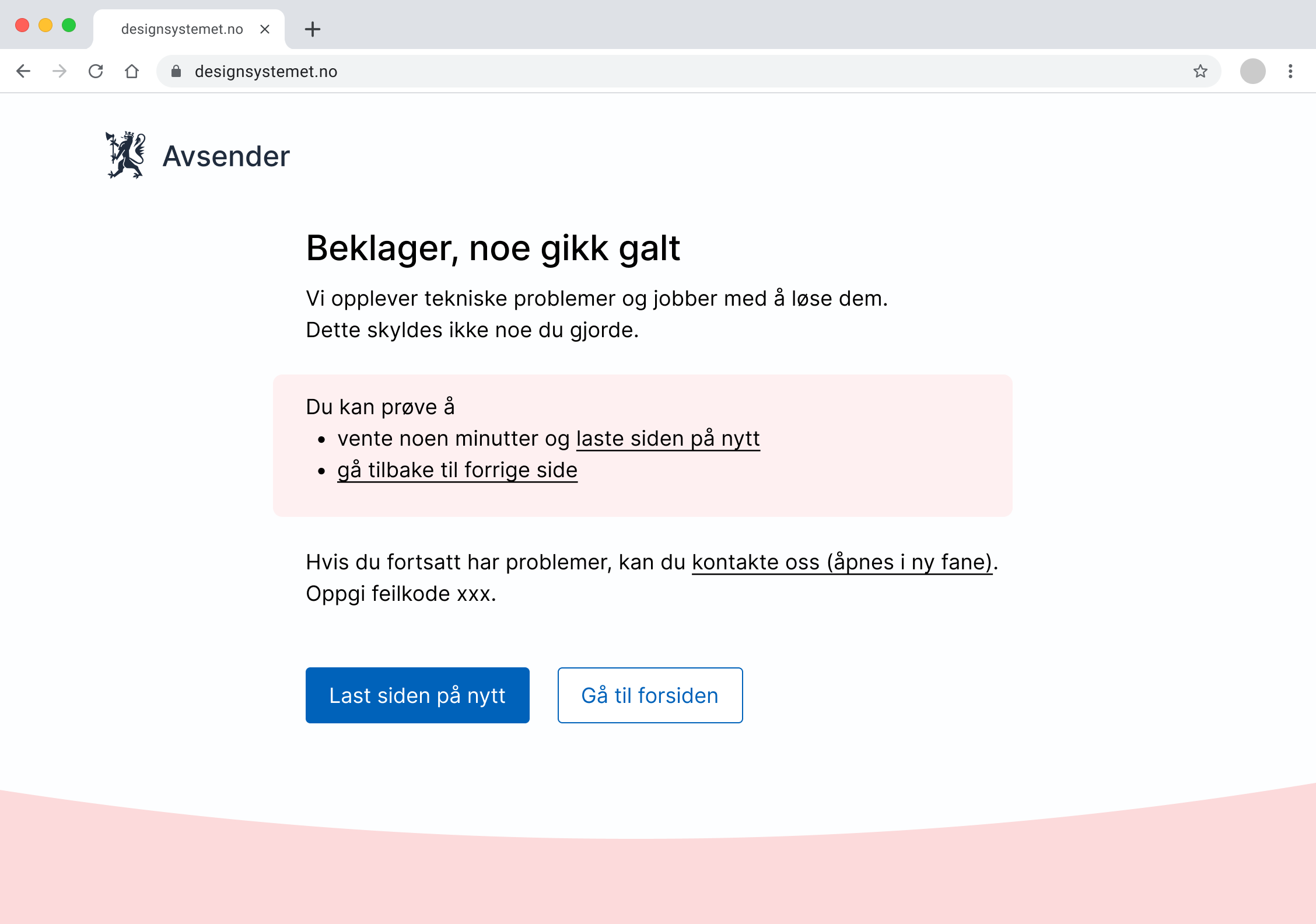
A full error page is often appropriate when serious technical errors occur that prevent the user from continuing to use the service. The advantage of error pages is that they don't compete for attention with other elements on the page.
We can use error pages when
- technical errors have occurred that make the entire service unavailable
- users try to load a page that doesn't exist
Error pages are not suitable when
- the technical error is limited to one function or component
- the user can continue to use other parts of the service
- parts of the content are unavailable
Always tell users what's wrong and how it affects them and/or the system. We should also say something about what users can try themselves, and where they can get help.
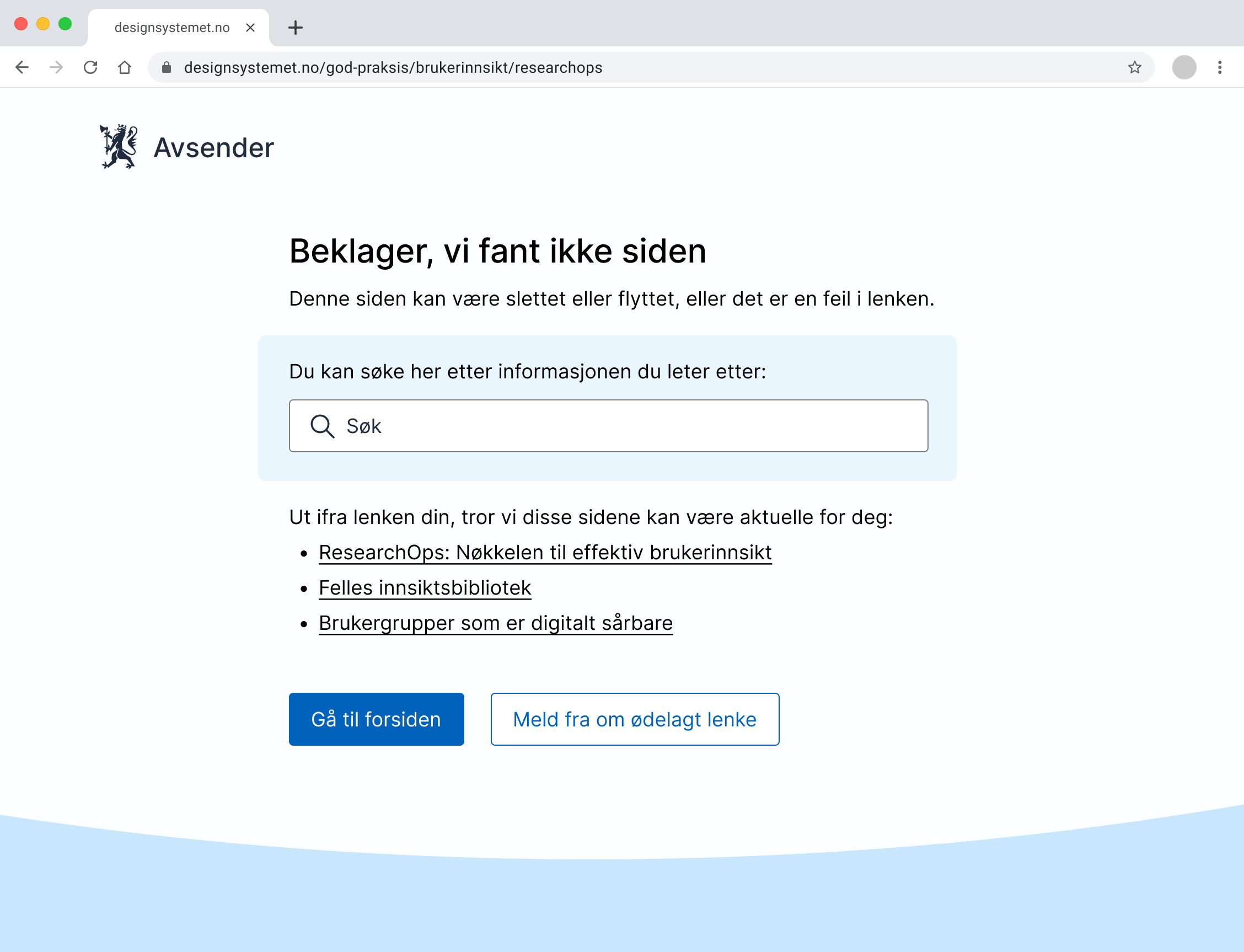
When the page doesn't exist
When a user tries to access a page that doesn't exist, we can also use a full error page. Then we should
- give the user the ability to search for the information
- give users suggestions for other relevant pages based on the same URL
- give the user the option to go to the home page
When do we use modals?
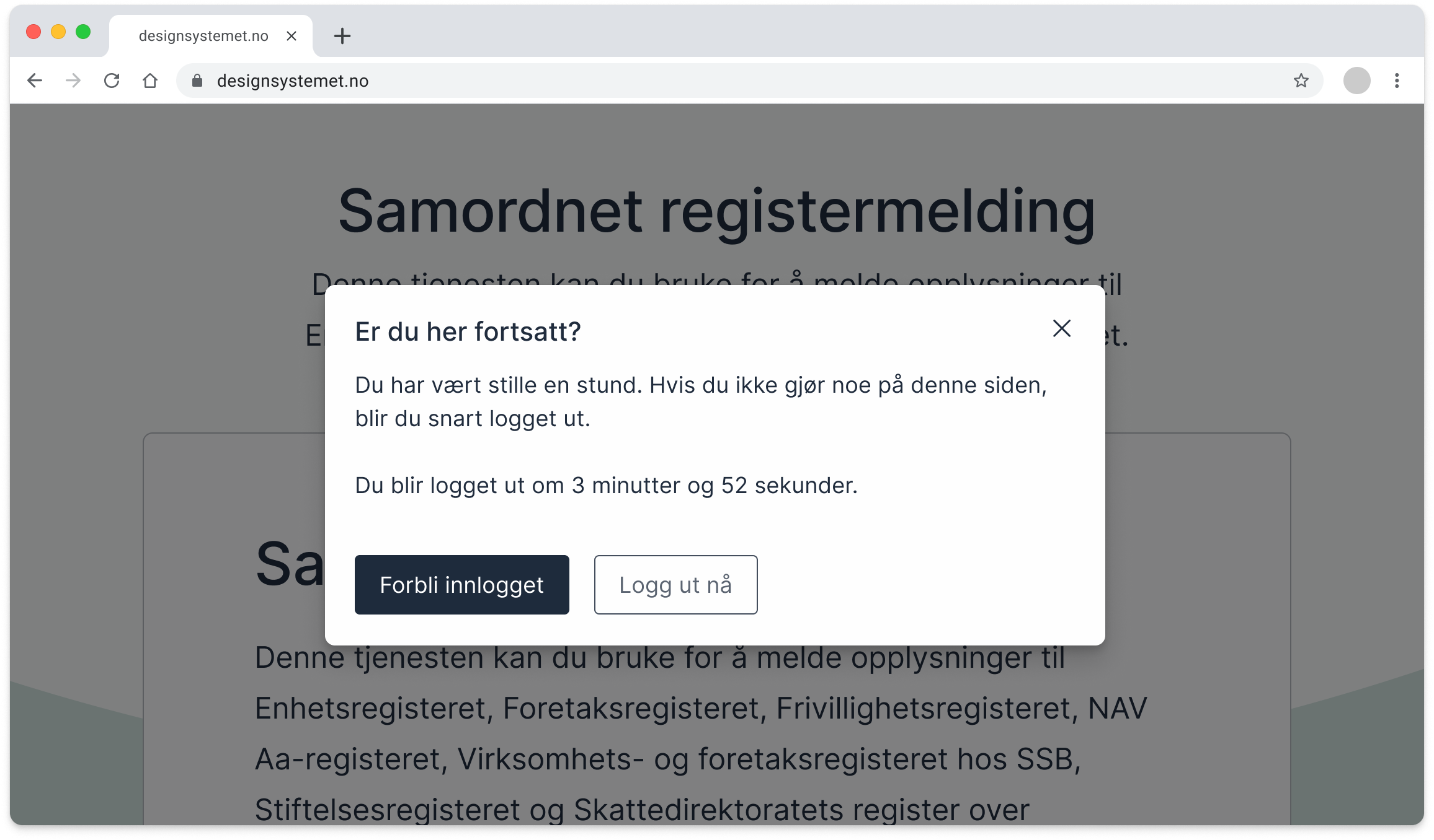
With a modal, we can capture users' attention while they still see where they are. But modals also disrupt the workflow users are in, so we should only use them when absolutely necessary.
We recommend modals for system notifications that require users to do something right away. For example, when the system for security reasons cannot let you stay logged in for more than a certain amount of time when you're not active. The modal gives the user a choice to remain logged in.
We can also use modals when
- it's important that users see the information anyway
- errors occur that prevent users from continuing to use the service, for example when the system has downtime or when data is not being saved
- the system requires users to decide something before they can continue, for example if they need to choose settings that affect their further work
When are modals not suitable?
- For messages that come too frequently, it can create frustration.
- For notifications that aren't so important, typically those that can wait until users want to deal with them themselves.
When do we use alert?
Alert is designed to give a message to users. It's often divided into different variants depending on how important the message is. We can show alerts at the top of the interface (global context), or they can be shown near the error (local context).
We can use alert when
- the error only affects one part of the system or a smaller function that doesn't stop the user's ability to continue other tasks
- there are connection problems or API errors that will be resolved with a new page load
Alerts are not suitable when
- the error prevents all further use of the service (use an error page instead)
- you want to draw the user's attention to errors in individual fields (use
ValidationMessage) - the notifications are static info boxes (use
card) - it's the only content on a page
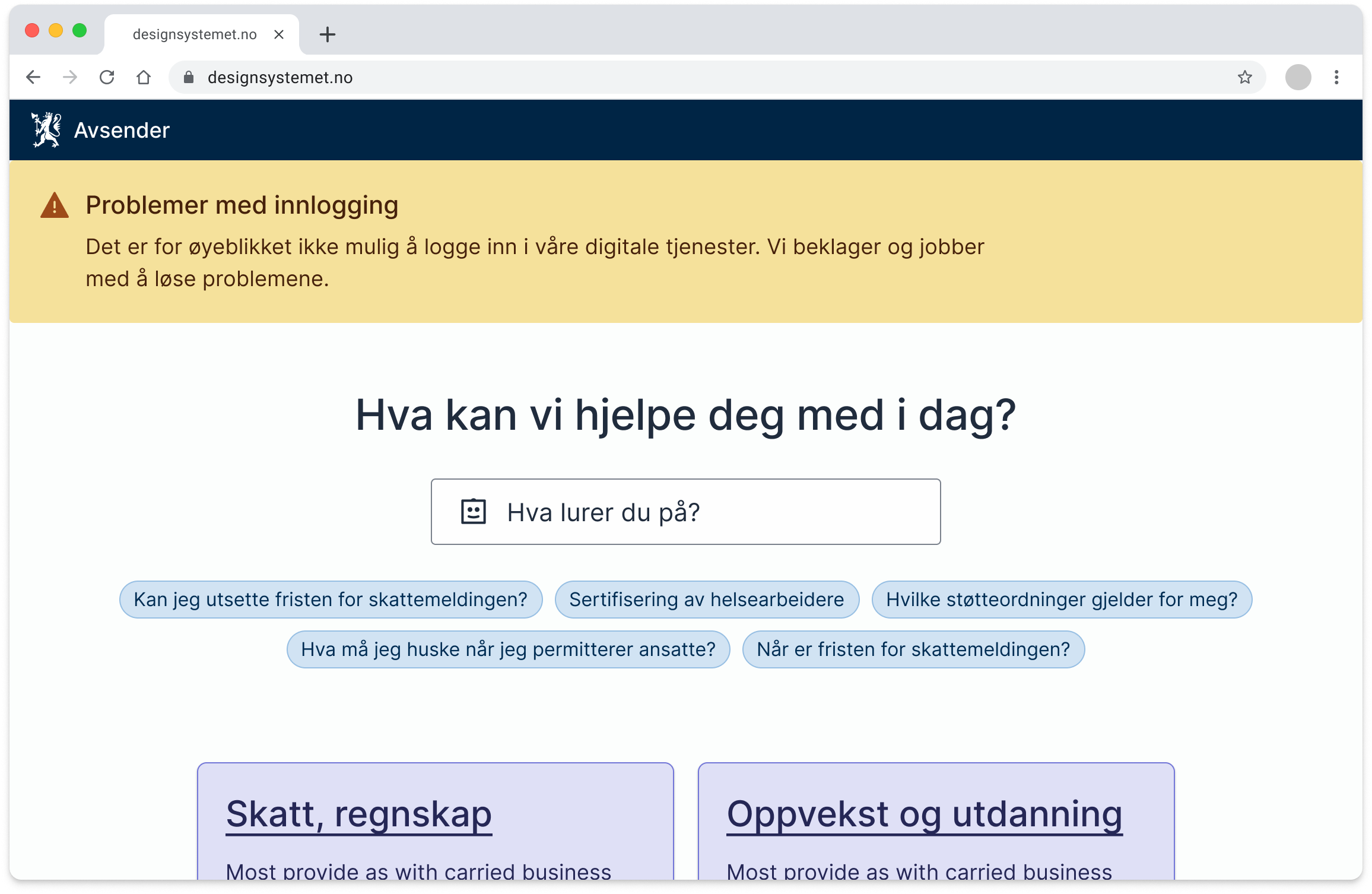
In the example below, we see a global alert that fills the entire width at the top of the page. This type of notification is recommended for problems that affect the entire service. We use a yellow alert (warning) when users can still find information and navigate the website, but where some parts of the page are unavailable.
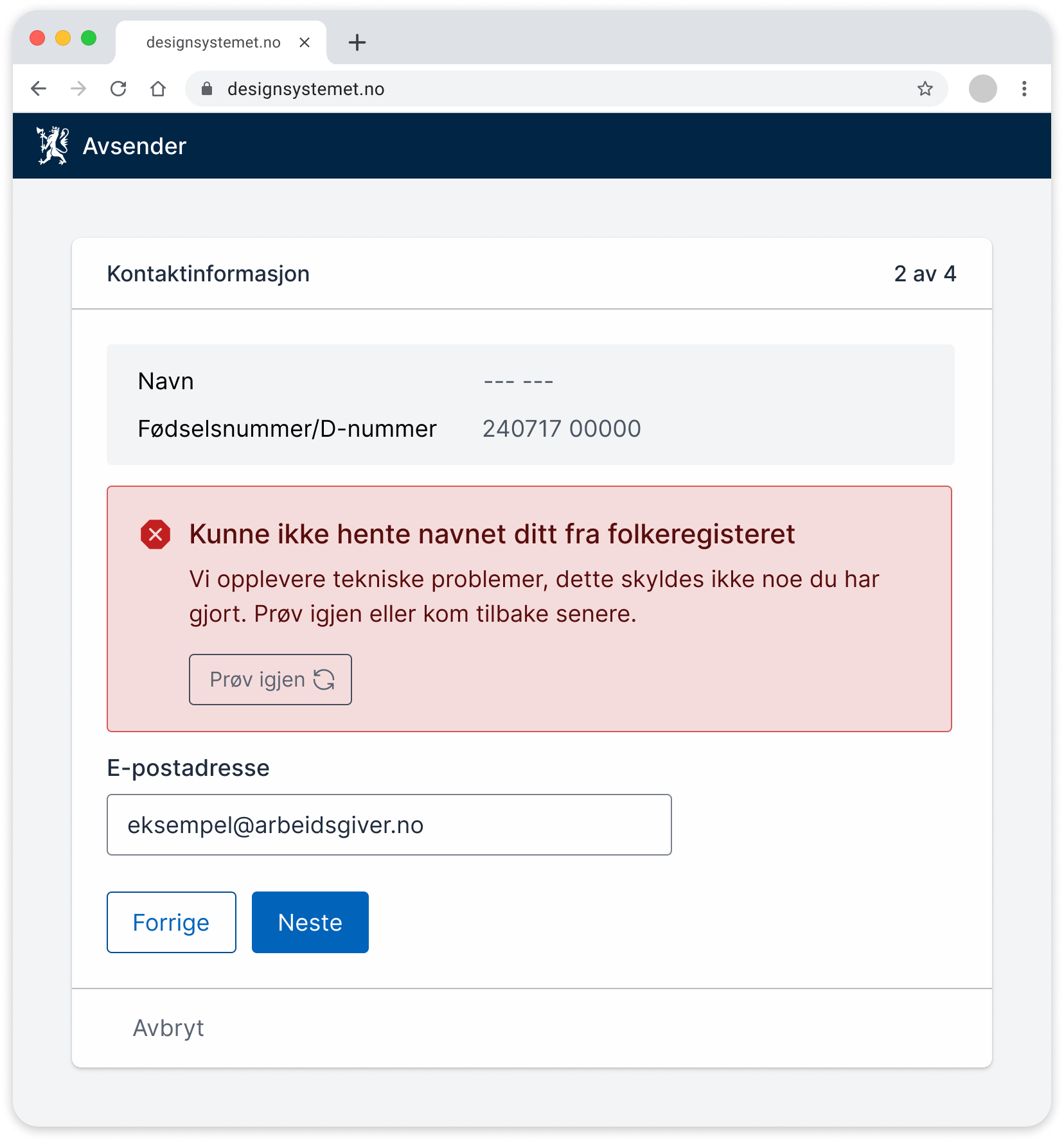
The next example shows a local alert that is placed near where the error occurred. We use a red alert (danger) in cases where users cannot continue their work. It remains as long as the error exists.
Code
To ensure that all users receive system notifications at the right time, you must make sure to use the correct attributes.
Static notifications
Notifications that are displayed at page load are called static notifications. These don't need any special attributes, as they are visible from the start and can be placed logically in the content hierarchy. Be aware of which heading level the notification gets in the content hierarchy.
Dynamic notifications
Notifications that appear after the page has loaded are called dynamic notifications. These notifications should, for example, use role="alert". To ensure that screen readers perceive the change in content, role="alert" can be placed on a <div> that is empty at page load, and then the content in the <div> is updated when the notification should be displayed.
Example:
By using an empty alert that can be filled with content dynamically, we ensure that screen readers perceive the notification as soon as it is filled with text.
Levels for dynamic notifications
For critical notifications that must be read immediately, use role="alert", which ensures that the screen reader interrupts ongoing readings and reads the notification as soon as the content changes. For less serious messages that can wait, role="status" may be a better choice, as this doesn't interrupt, but is read when the screen reader has time.
Example:
Read more at uu-tilsynet about which roles you should use on different elements.
Modals
When a dialog opens, it's important that it receives focus, so that users can immediately interact with the content. Often it's natural to set focus to the first interactive element. In some cases, it may be appropriate to focus on another element, such as the heading. Then you must use tabindex="-1" to ensure that focus can be set on a non-interactive element.
Example:
This allows the modal title to receive focus, even though it's normally not an interactive element. When the modal closes, the focus should return to a logical location on the page. For example, where the user was before.
Relevant links
These guidelines have been developed in a cross-agency working group with participants from Digdir, Nav, Norwegian Tax Administration, Brønnøysund Register Centre, Police, KS, Entur, Norwegian Food Safety Authority, and Oslo Municipality. You can influence the work in the discussion thread about system notifications on Github or in the #Pattern channel on Slack.