Colors
The color system consists of global colors that refer to what the color is (e.g., red-1) and a semantic level that describes what the color should be used for (e.g., Text.Danger).
Naming structure
The colors in Designsystemet are structured with a semantic meaning. This means they are defined by function and use, not just by how they look. This makes it easier to choose the right color because you don't have to evaluate the color tone itself and can focus on what the color should communicate instead.
The color names in Designsystemet are divided into 3 parts: Name of the color scale, group (area of use), and variant. These parts describe how the colors are built up and how they should be used.

-
NameThe first part and the name of the color scale. By default, Designsystemet comes with the color scales Success, Danger, Warning, Info, and Neutral. More scales can be added using the Theme Builder. -
GroupEach color scale is divided into the groups Background, Surface, Border, Text, and Base. These groups describe the areas of use for the colors. For example, the Text group should be used for text and icons.
VariantWithin each group, there are variants that describe how the colors look or should be used. For example, Tinted means the color has a hint of color in it, while Hover means the color is intended to be used for an interactive state.
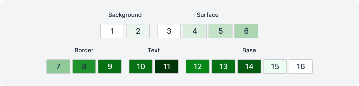
Overview and explanation of colors
Each color scale consists of a total of 16 colors, designed to cover different needs in the design. Below you'll find an overview of the different colors and their intended uses.
| Navn | Bruksområde |
|---|---|
| 1. background-default | Standard bakgrunnsfarge. |
| 2. background-tinted | Bakgrunn med et hint av farge i seg. |
| 3. surface-default | Standardfarge for overflater / komponenter. |
| 4. surface-tinted | Overflater / komponenter med et hint av farge i seg. |
| 5. surface-hover | Hover-farge til overflater / komponenter. |
| 6. surface-active | Active-farge til overflater / komponenter. |
| 7. border-subtle | Border-farge med lav kontrast til dekorativ bruk (skillelinjer). |
| 8. border-default | Standard border-farge til skjemakomponenter og meningsbærende elementer. |
| 9. border-strong | Border-farge med høy kontrast for ekstra synlighet. |
| 10. text-subtle | Tekst- og ikonfarge med lavere kontrast. |
| 11. text-default | Tekst- og ikonfarge med høy kontrast og god synlighet. |
| 12. base-default | Standardfarge for solide bakgrunner. |
| 13. base-hover | Hover-farge for solide bakgrunner. |
| 14. base-active | Active-farge for solide bakgrunner. |
| 15. base-contrast-subtle | Farge med god kontrast mot Base-default. |
| 16. base-contrast-default | Farge med god kontrast mot Base-default og Base-hover. |
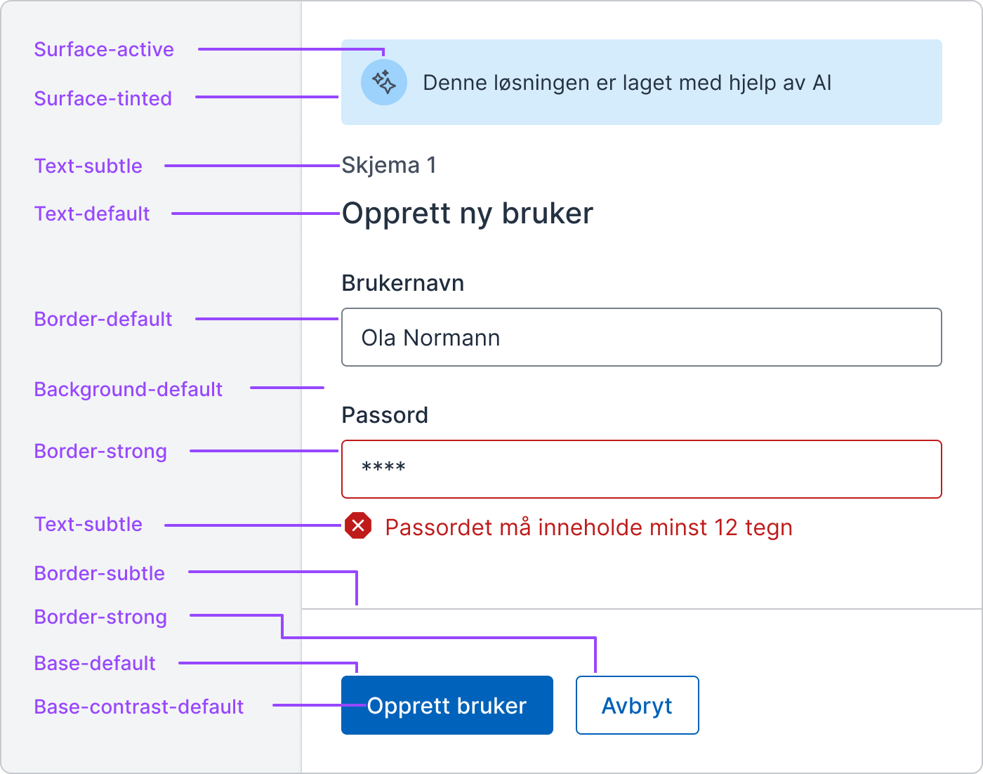
Background
Background colors are used to color large surfaces and are often the back layer on a website. It's common to use these colors on the body element.
Background-defaultis the lightest and most neutral background color.Background-tintedgets a hint of color in it and can be used to create variation in the background layer.
Surface
Surface colors are used to color elements that sit above the background colors, such as panels or cards. These colors serve as foreground colors and help create depth in the design by separating elements from the background. In dark mode, these four colors become gradually lighter, with Surface-active being the lightest.
Surface-defaultis completely white in light mode and is used as the standard background color for elements.Surface-tintedgets a hint of color in it and can be used to distinguish elements from the background.Surface-hovercan be used for hover states for elements or to create visual hierarchies in the Surface layer when combined with Surface-tinted and Surface-active.Surface-activecan be used for active states for elements or to strengthen the hierarchy in the Surface layer together with Surface-tinted and Surface-hover.

Border
Border colors are used to color frames (strokes) of elements.
Border-subtlehas low contrast against background and surface colors and should only be used for decorative purposes. Common use cases are dividing lines and decorative frames. The color should not be the only visual indicator that an element is interactive.Border-defaultis used on form components or on other meaningful frames. The color has good contrast (over 3:1) against all background colors, Surface-default, and Surface-tinted.Border-stronghas good contrast (over 3:1) against all background and surface colors and can be used on frames to make elements extra visible.
Text
Text colors are used for text and icons.
Text-subtleis a light text color that can be used to create variation in typography or to indicate hierarchical levels of importance. It also tries to preserve as much of the color saturation from the original color chosen in the Theme Builder. The color has good contrast (4.5:1) against all background colors, Surface-default, and Surface-tinted.Text-defaultis a text color with high contrast, optimal for readability. It should be used for the main content and the primary text on a page. This color in the Neutral variant can be a nice color to use for most of the text. The color has good contrast (4.5:1) against all background and surface colors.
Base
Base colors are used to color solid backgrounds, such as buttons and other interactive elements. The colors help direct attention to important design elements and establish a visual hierarchy in relation to less prominent elements. At the same time, they create contrast against background and surface colors, which enhances readability and visual clarity.
The Base-hover and Base-active colors are generated based on the lightness or darkness of the Base-default color to create smooth visual transitions between states. The contrast colors become either white or black depending on the brightness of the Base-default color to ensure good contrast and readability.
Base-defaultcan be used to color solid backgrounds of elements. The color (hex code) chosen in the theme builder is placed under Base-default.Base-hovercan be used for hover states for solid elements or to create visual hierarchies in the Base layer when combined with Base-default and Base-active.Base-activecan be used for active states for solid elements or to strengthen the hierarchy in the Base layer together with Base-default and Base-hover.Base-contrast-subtlehas good contrast (4.5:1) against the Base-default color from the same color scale and can safely be used as a text color against it.Base-contrast-defaulthas good contrast (4.5:1) against the Base-default and Base-hover colors from the same color scale, and can safely be used as a text color against these.

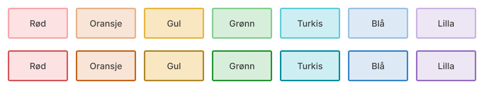
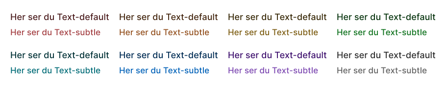
Color tokens
The colors below are examples from a random theme. Use the theme builder to generate your own colors and names.
Rediger denne siden på Github (åpnes i ny fane)