Design Tokens
What are design tokens
Design Tokens control how components should look in terms of colors, typography, sizes, spacing, shapes, etc. Design tokens ensure that both designers and developers work according to the same rules and guidelines.
Some of the variables are set up to be theme-based, meaning they are based on your brand with the colors and preferences you choose. We are working on a theme builder that will make it easier for you to customize the styles.
Design Tokens are flexible variables that can be used regardless of technology or design tool.
Design tokens in Figma
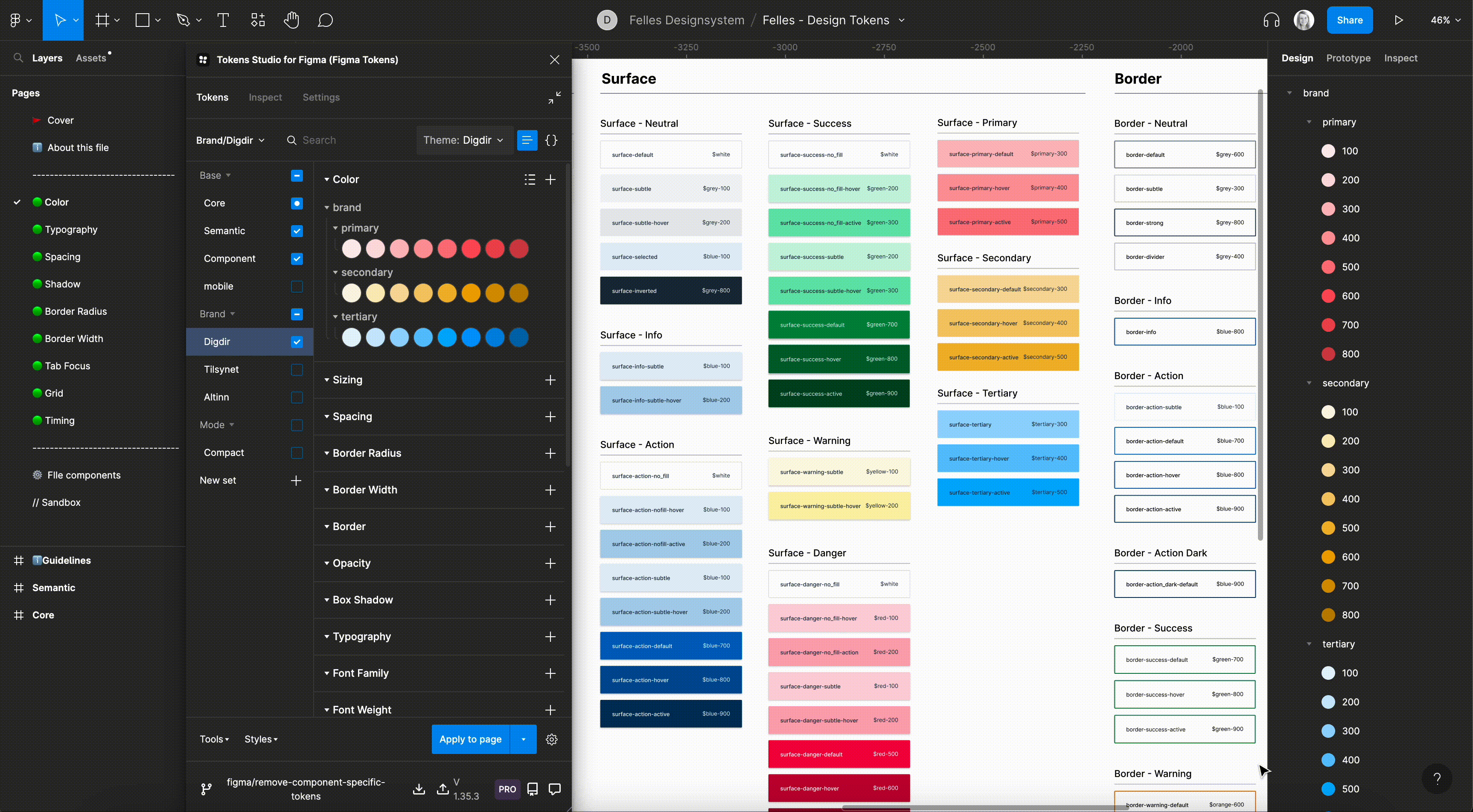
We use the Figma plugin "Tokens Studio", as it allows us to manage more styles and properties than Figma itself can.
The plugin aims to be W3C compatible and follows the standard established by the W3C Design Tokens Community Group. The token values are therefore not locked to a tool - the JSON file can be moved to other tools if needed.
Multiple sets and themes
Using variables and tokens makes it possible to have one design system with different identities. We can create a component in Figma only once and style it many times - With a click we can activate another theme that, for example, activates a different color palette or a different set of sizes. By dividing tokens into both sets and themes, we can offer advanced forms of reuse.
Design tokens for developers
Install the NPM package @digdir/designsystemet-theme and follow the description there on the use of tokens. Override as needed.
Rediger denne siden på Github (åpnes i ny fane)