Set up your own color system
With a well-thought-out color system, we can ensure that text always has sufficient contrast against our background colors and that there are enough different colors for all states.
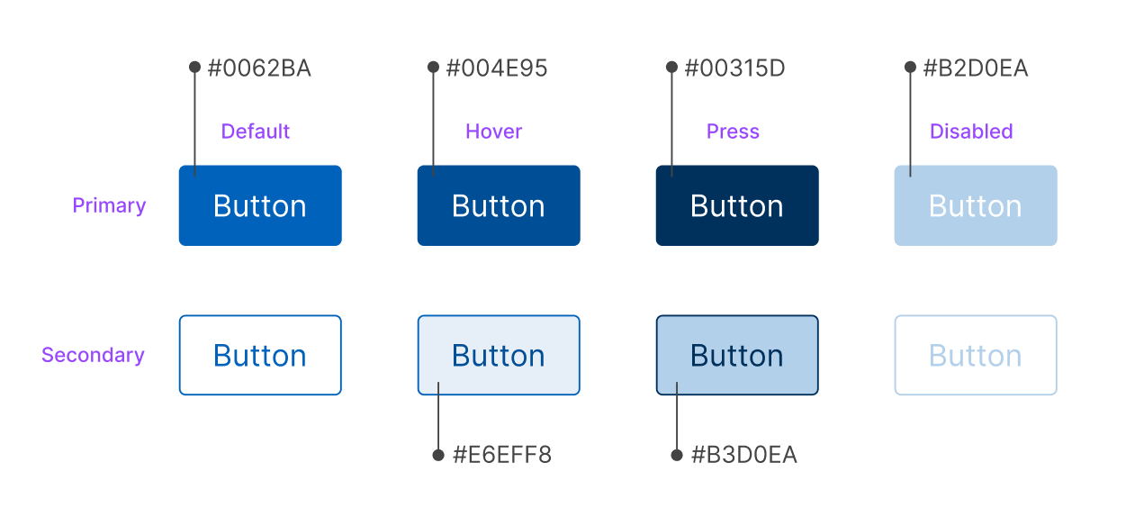
A brand guide often contains only a set of primary colors and secondary colors in a couple of different color tones. Creating a digital product with these colors alone is difficult. To ensure proper contrast and correct colors for different states, we need to define more variations of the brand colors. Just the button component consists of 6 different blue colors:
The color system is structured to support multi-branding and different modes (dark mode, contrast mode, etc.), while maintaining contrast requirements. We've been inspired by USWDS's "magic numbers" to ensure accessible color combinations from any color palette. We've also been inspired by Radix's color system with clear intentions for the different colors. To ensure that an organization can use its actual brand color, we've chosen to combine two approaches into a completely new system.
Designsystemet's theme generator
To generate a scale that works, you can use the Design System's theme generator. All you need to do is paste in the hex code of the brand's accent color and other brand colors.
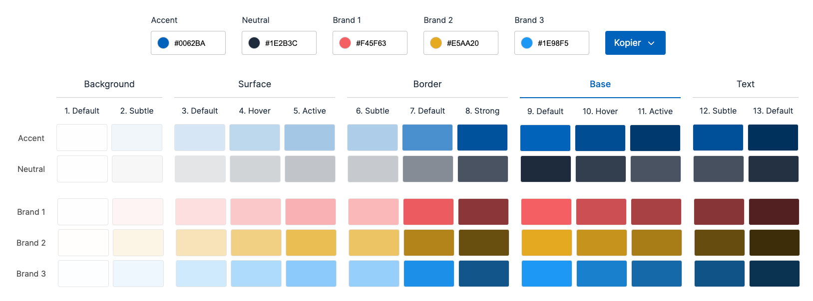
The theme generator is based on a color system that ensures that both brand colors are maintained and contrast requirements are secured through the linear colors generated from the brand color. Colors intended for text will therefore always have sufficient contrast against background colors.
Examples:
Text-defaultalways has sufficient contrast against allbackgroundandsurfacecolors.Text-subtlealways has sufficient contrast against allbackgroundcolors andsurface-default.- This will apply regardless of what you have chosen as the base color.
The Base-default color will always be the same as the color you have chosen. This is to maintain your brand as best as possible. You must therefore ensure that the color you choose meets the contrast requirements in relation to where it will be used. The Design System's theme generator will inform you of any contrast violations.
Let's look at an example where we change the colors:
Use the colors you have generated
When you have generated the scales, you can use the new color codes in Designsystemet, so that all components follow your brand.
Rediger denne siden på Github (åpnes i ny fane)