Sizes and Spacing
Component Sizes
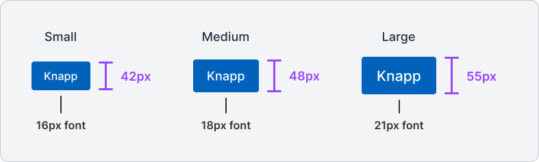
Most components in Designsystemet come in three recommended sizes: Small, Medium, and Large (sm, md, lg).
These are developed to adapt to different needs across screen sizes and use cases.
Small is ideal for compact interfaces where space utilization is important, such as on mobile devices, expert tools, or administrative interfaces.
It is recommended to use this size on websites with a base font of 16px.
Medium serves as the standard for most common use cases, and is recommended to use with a base font of 18px.
This size provides a good balance between readability and space utilization and is particularly well-suited for desktop interfaces and larger display surfaces.
Large provides increased readability and clarity. It can be used in desktop interfaces or when visibility and accessibility are important. It can also be used in a defined context on the page to highlight key elements.
It is recommended to use this size with a base font of 21px.
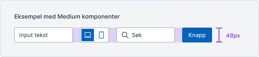
Components within a specific size are designed to work together.
For example, many medium components have a height of 48px and a base font of 18px, which ensures a harmonious visual balance when placed next to each other.
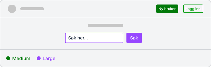
To maintain a coherent and clear design, it is recommended to use fixed sizes within a given website or context. Many different combinations of sizes can lead to a cluttered and confusing design.
In some cases, components of different sizes can be combined to create better visual hierarchies and user-friendliness. In the example above, the search field section is larger and more prominent than the components in the header, because the search function is a central part of the page. The increased size makes it more visible and easily accessible to the user.