Modes in Figma
In Figma, you can use modes to quickly adjust size, colors, and typography. Previously, such changes had to be made manually for each component, but now you can adjust all selected elements simultaneously with just a click. This means you can quickly change an entire interface to a different size.
What are modes in Figma?
Modes are predefined settings in Designsystemet Core UI Kit that allow you to easily switch between different themes, colors, sizes, and typography. This makes it easier to customize the design without time-consuming manual adjustments.
In the Core UI Kit you have the following modes:
- Theme – Choose between different themes
- Color scheme – Switch between light and dark mode
- Main and support color – Select which color to use on components
- Typography – Change font type and style
- Size – Adjust size of components, text, and spacing
Below we go through how these work.
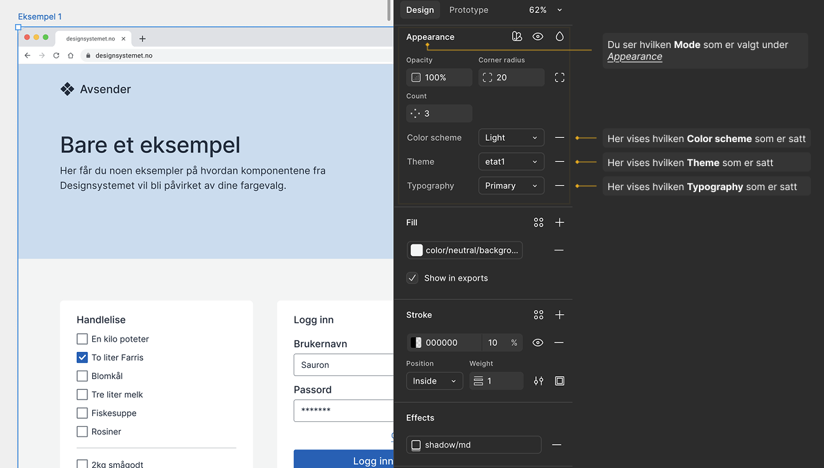
How can you see which mode is selected?
Designers can easily switch between different modes in Figma and see information about the selected mode. Those in view-only access will not be able to see which mode is selected or its information, such as Color scheme, Theme, or Typography. This information is only available to those with editing access or those using Dev Mode in Figma.
How it looks with view-only access:
Here you can see that information about the selected mode is not visible with view-only access.
How it looks with editing access:
When you have editing access, you can see which mode is selected for the entire design.
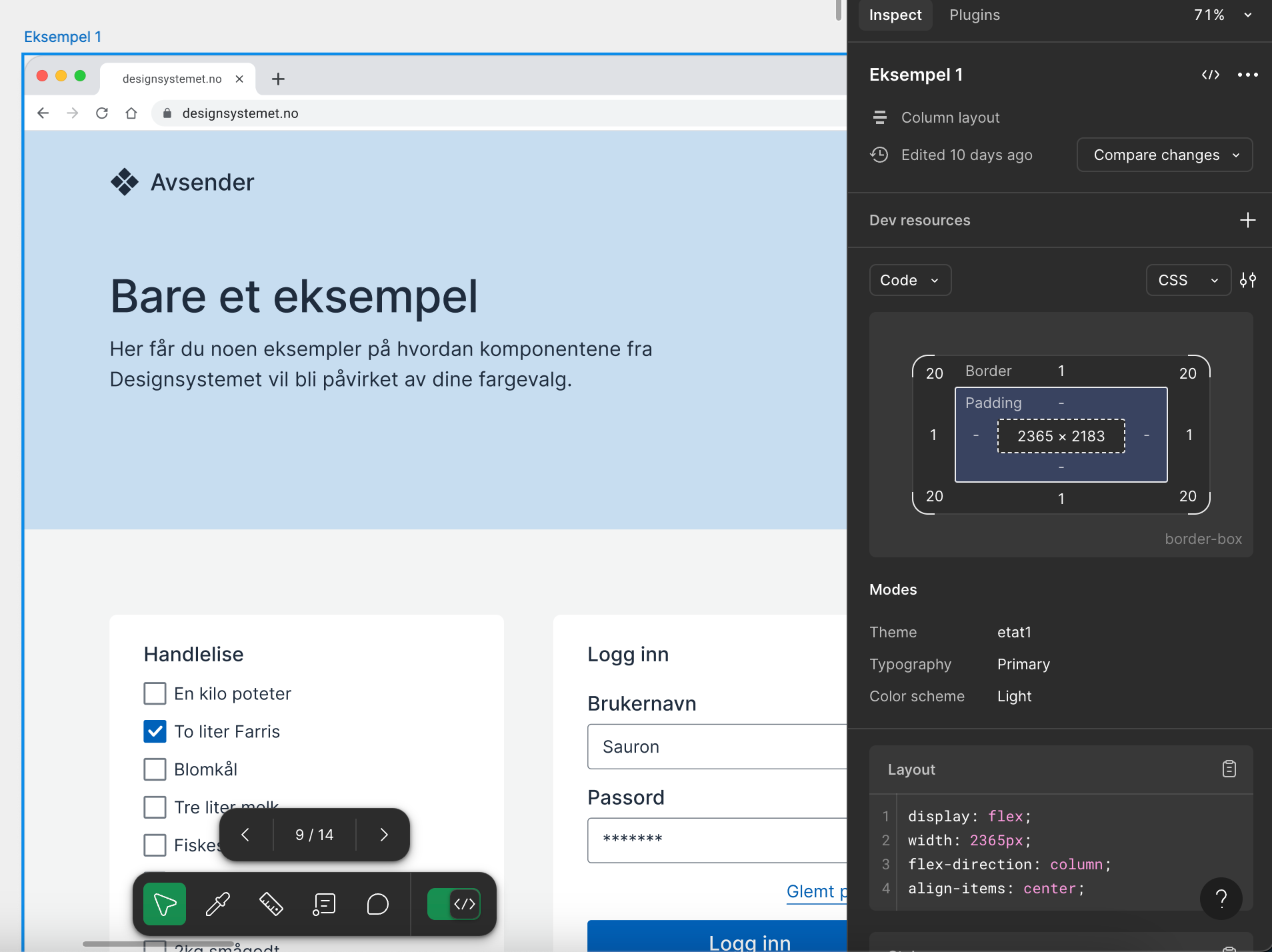
How it looks in Dev Mode:
If a mode is set on an entire frame, it is only visible in Dev Mode when the frame itself is selected. Dev Mode only shows which mode is set on the element it is applied to, not further down.
Theme
In Theme mode you select which theme the design should use. When you change the theme, the entire design automatically updates, from colors and typography to other design elements, without having to adjust each component manually. This gives you the ability to quickly adapt the design according to the organization's visual identity and specific needs. For some organizations, one theme is sufficient, while others need multiple. The themes shown depend on which themes are set up for your organization. Themes can be built in the Design System's theme builder.
The video below demonstrates how you can change Theme in Figma:
Color scheme
Color scheme mode lets you switch between Light and Dark mode. You can use this setting on the entire design or just on specific areas, such as a header or footer. When you change the color scheme of a section, only that part changes, while the rest of the design remains unchanged.
Here's how to switch between Light and Dark mode in Figma:
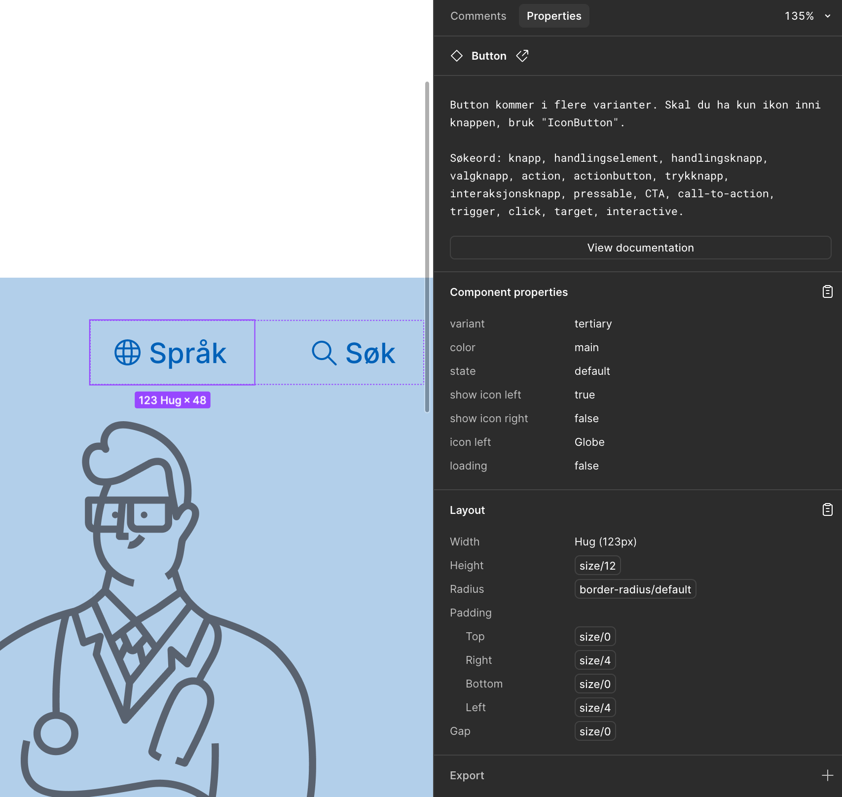
Main color and Support color
To offer the ability to change colors on components, we've created two modes called main and support color. These will contain the colors you entered in the theme builder. In main colors and support colors respectively. The components come in either support or main variants. To change the color of main and support variants, you use modes. Note that the component must be a main or support variant for the option to appear in the modes menu.
Here's how to change Support Color on a component:
Typography
In Typography mode you can easily change the font type across the entire design. When you switch modes, all text is automatically updated, so you don't have to adjust each component manually. This gives you the ability to quickly adapt the design according to the organization's typographic guidelines or specific needs.
Here we see how you can change Typography in Figma:
Size
In Size mode you can change the size globally for the entire design or adjust specific areas, such as a header, card, or headings. You can choose between predefined sizes such as small, medium, and large, depending on context and needs. This provides flexibility to adapt the design for different screen sizes and use cases.
Here's how to adjust the size of elements in Figma:
Customize colors and preferences in the theme builder
In the theme builder, you can define colors and other visual settings for your design. See the guide Use Designsystemet with your own theme to get started.
Rediger denne siden på Github (åpnes i ny fane)